|
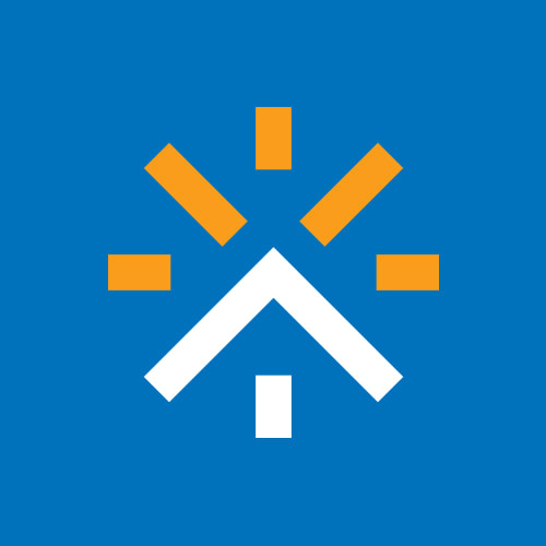
Kinetic Branding recently completed a logo design for Legacy Solar + Smart Home, a new company that installs solar panels and other smart technology in residential homes.
The new company logo design by Kinetic incorporates the icon of an orange sun which symbolizes the company's solar panel services, combined with a blue roof and window that symbolizes home services. Together, these icons add up to a smart and iconic logo design for Legacy Solar + Smart Home.
Stay connected to this blog to see Legacy's upcoming new website. Kinetic Branding recently completed a product naming and product logo design project for a new experimental single engine aircraft for RDD Enterprises, an aircraft manufacturer located in Redmond, Oregon. Back in May of 2017, Kinetic designed a logo and other brand identity projects for the company's first-ever semi-manufactured aircraft, the LX7 (shown below). It was RDDs foray into aircraft design, and it was a major hit. The LX7 outperformed all expectations, winning multiple aviation records, and Kinetic Branding was there to tell the unique amazing brand story.
Recently, RDD developed an even more innovative airplane, designing the entire aircraft completely in-house and adding more than two dozen new features. The new aircraft needed a new name and logo, but simply calling it the "LX8" would do this innovative machine an injustice.
Kinetic developed the new name, the “LX∞” (LX-Infinity), and designed the new logo (shown above). The new name and logo had to be related to one another, yet the new aircraft name had to also separate itself significantly from its predecessor. Stay connected to this blog to see much more of the new LX∞ aircraft. As per New Year's Day tradition, Kinetic Branding is highlighting some of the logos designed in the previous year. Our clients are enjoying their new logo marks as this new year begins. Below are some logos that Kinetic designed for their clients. 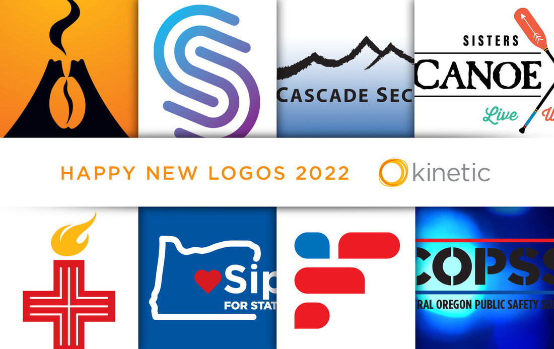 Happy New Year to you. Let us help you make your Mark in 2022.
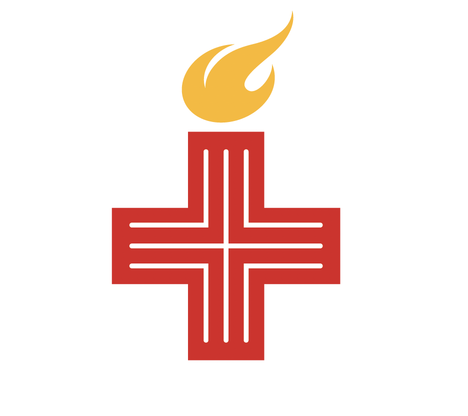
Kinetic Branding completed the logo for Voices for Medical Freedom, a private community of social influencers – athletes, musicians, entertainers, actors, scientists, leading business people, and elite military personnel – who align with the mission of medical freedom
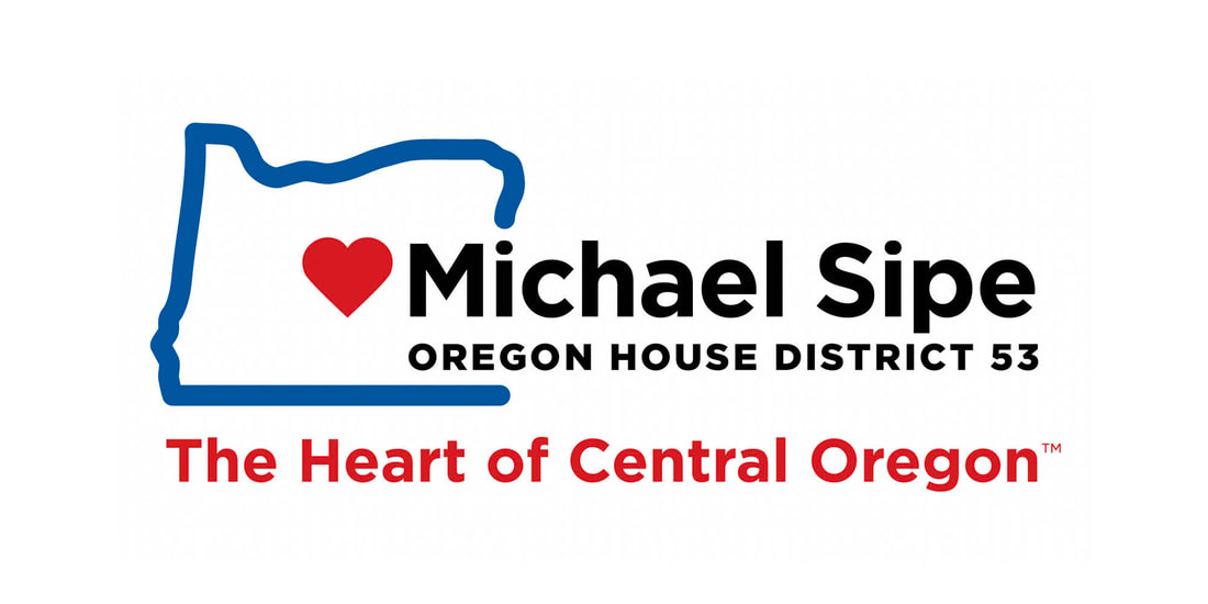
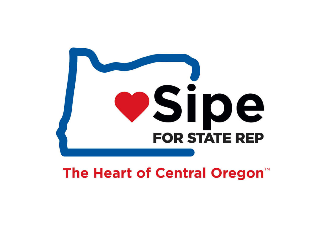
The new logo design is the combination of a medical cross (+) with a torch that represents liberty and freedom. The small white lines represent arrows coming together and helps show connection and community. Stay connected to this blog for the coming website design for Voices for Medical Freedom. Kinetic recently designed a new political campaign logo and theme for Central Oregonian Michael Sipe, who is running for an Oregon State House Representative position.
The final chosen logo design for the Michael Sipe political campaign has an outline of Oregon with a red heart in the center where Central Oregon is located. The campaign theme The Heart of Central Oregon communicates Michael's love for the area and his service to the people.
Kinetic Branding recently completed an exciting and energetic brand identity project for Sisters Oregon Canoe Club, a new and hip retail shopping, business work space and living complex.
Kinetic created a clear campaign theme of "Live. Work. Shop." with a vibrant, modern and youthful brand identity design. Geared towards 20- and 30-somethings located in a town surrounded by the Oregon wilderness, Canoe Club now has a unique, relatable and outdoorsy look and feel.
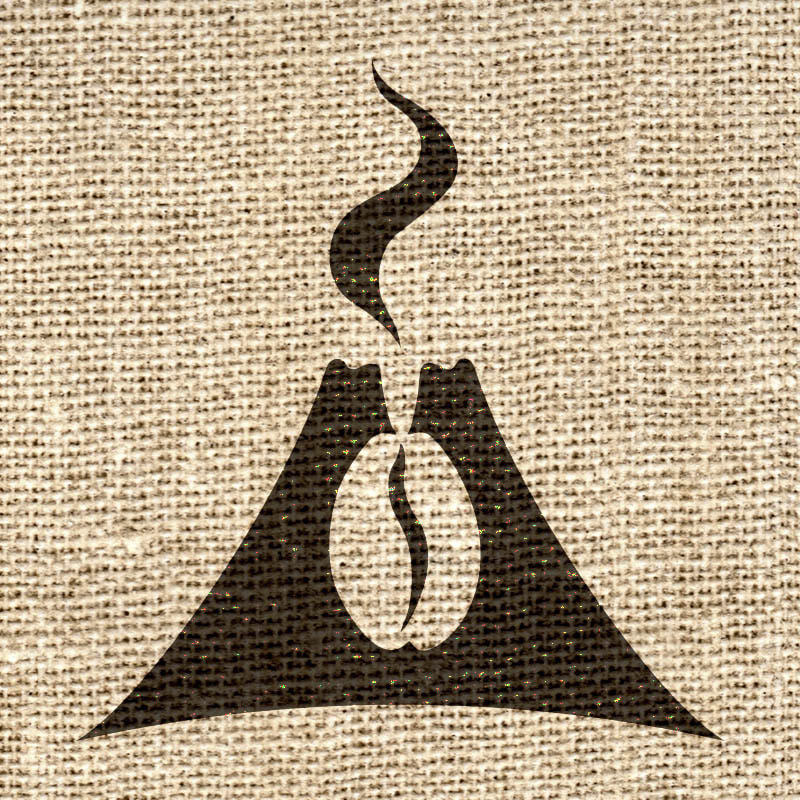
The new logo design is very versatile, and can work on a white or reverse black background, it can be in color or black and white, and Kinetic also designed a Canoe Club crest logo version for merchandising opportunities. Stay connected to this blog to see more brand identity designs that Kinetic has in store for Canoe Club. Kinetic Branding recently completed a logo project in conjunction with a friend and artist, Donald Yatomi, for startup Pohaku Coffee in Hawaii.
The new logo design has a volcano with a coffee bean brewing inside and steam rising through the top. The overall logo design is bold and distinctly Hawaiian.
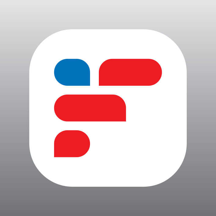
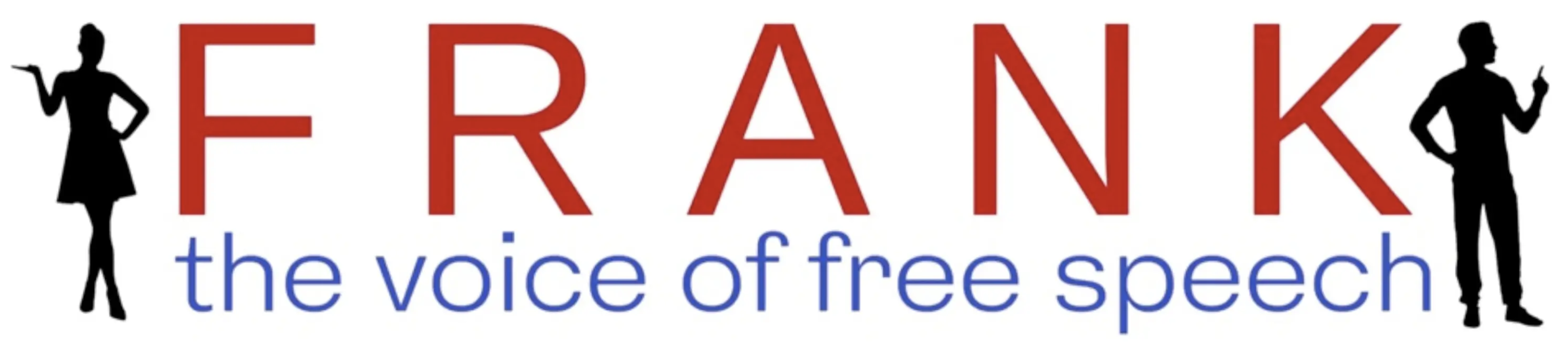
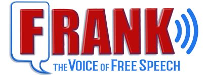
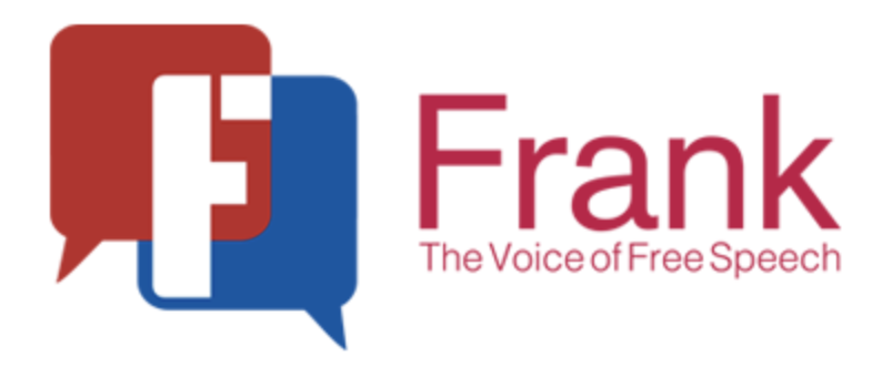
Kinetic has also engaged with Pohaku Coffee to design their product packaging bags, company website and more. Kinetic Branding is working with a new startup social media platform to give the organization a legitimate presentation to the American audience. We love design. We love branding. We love to communicate the core felt needs of a company to their consumers. We felt that the logo they initially designed did not accurately communicate the core values of the company, so we offered an alternative approach.
Frank is a social media platform that allows users to voice their first amendment free speech and express opinions without fear of being cancelled. The logo mark designed by Kinetic is in the shape of an "F" for Frank. The "F" is also made up of red and blue talk bubbles representing a dialog. And finally, the red and blue talk bubbles represent the American flag which stands in part for free speech. The logos shown below are the company's various attempts at a logo design for the new online business.
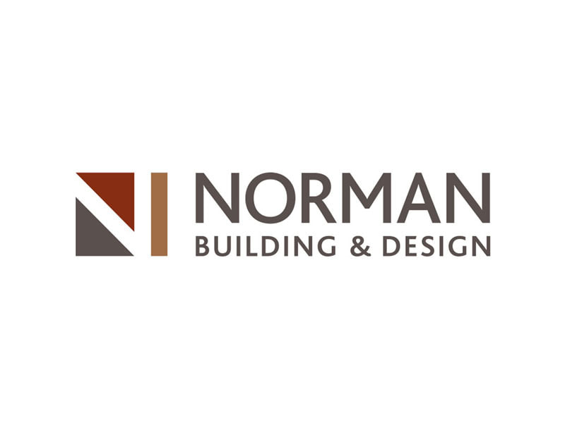
In designing a company logo, negative space can be a very positive asset for your company's brand identity and draw people to connect with your products or services. Negative space refers to any visual space that surrounds or appears within a subject, and it’s a great way to highlight a relationship between different elements of your company's brand. Clever usage of negative space can provide consumers with a positive response and an affinity for your brand when they discover that visual "Easter egg." Below are a few examples of how Kinetic Branding has used negative space when designing company logos. (Click on a logo below to enlarge)
Kinetic Branding recently updated a logo for Cascade Security, a security company, by simplifying the design and making a memorable brand identity.
The new logo maintains a similar brush stroke design style, while minimizing the design and better reflecting the local mountain terrain.
Stay connected to this blog for the Cascade Security website update. |