|
Kinetic Branding is in the process of rebranding an Oregon networking group called PROS of Central Oregon and has just completed the organization's logo redesign. The networking group seeks to assist its members in achieving new heights of success within their professional careers by giving meaningful and relevant business referrals every week. In logo redesign, there's an "evolutionary" and "revolutionary" approach for company's seeking an updated company logo. Central Oregon Ranch Supply decided that they desired a substantial and modern logo redesign which would imply that they wanted a revolutionary logo redesign, but they also wanted to make sure that their long-established brand recognition was not ignored, which called for an evolutionary logo redesign. Kinetic Branding made sure to accurately balance the needs of their client. Kinetic Branding wanted to make sure they designed a "logo" and not an "illustration" when approaching the logo redesign. Many companies start out with a logo that looks more like a complex illustration rather than a simplified and well-designed logo that emits instant recognition.
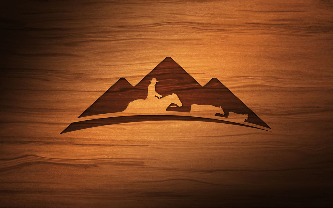
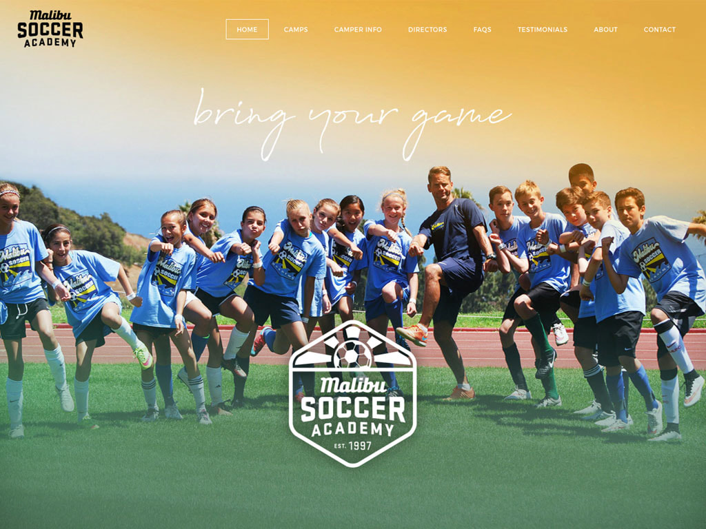
The original logo was a complex illustration with a rancher on horseback with seven head of cattle. The principles of successful logo design is to simplify, with the mantra "less is more." Major companies like UPS, Starbucks, FedEx, Apple and Microsoft all redesigned their corporate logos by simplifying the original design. Balancing the subtleties between evolutionary and revolutionary logo redesign, Kinetic decided that a limited display of rancher and cattle silhouettes could work as a reverse (or negative) image within a modern mountain-scape to maintain long-standing recognition. But Kinetic also realized that a simplified logo shape and a modern typeface would create the perfect balance between an evolutionary and revolutionary logo redesign. Stay connected to this blog for the C.O.R.S. website design.  Malibu Soccer Academy engaged Kinetic Branding to help them redesign their logo, website and brand identity image. The company is a large Malibu, California-based organization that helps young children and teens improve their soccer skills through a community group that embraces fun and discovery. Their original logo (shown above) and website for Malibu Soccer Academy focused on improving soccer skills, but lacked any social connection that would foster the core desire for belonging and human interaction. Below is a throwback blog post from our old website in 2012 of a logo redesign for Northwest Belt. Today, nearly six years later, Northwest Belt has taken full advantage of their redesigned logo as well as a redesigned website, and the company is actively growing and thriving. Brandmark Redesign for Northwest Belt12/14/2012 Kinetic Branding recently redesigned the company logo for Northwest Belt & Conveyor Company, an organization that refurbishes industrial grade conveyor belts for companies who want to save money. After determining the company's unique Brand Energy Formula of 1] Get the Best, 2] Control, and 3] Convenience, Kinetic began the logo design process by focusing on their formula. The original logo served Northwest Belt for the many years since the beginning, but needed to be updated with the company's growth. The old logo design did not connect with the company's core audience. It also did not present the company as a national brand that it has become over the years. Northwest Belt needed a new logo that better represented their company persona and could connect with consumers on a deeper level. Kinetic focused on two emotions ("Get the Best" and "Control") when designing the new logo. In creating a logo design that appeals to plant operators who desire to have the best and want control over their operations, Kinetic knew that by designing a logo that feels like a quality control badge or emblem, customers would be reassured that the company is focused on the highest of standards.
See Our Logo Design Portfolio > Kinetic Branding recently completed a naming and logo project for New York-based ASI System Integration. ASI is North America’s leading independent provider of IT services, solutions, and technologies. The company engaged Kinetic to rename the company and design its new corporate logo and website.  Old ASI Logo Old ASI Logo ASI was one of many 3-letter initial named organizations in the IT industry, like CDW, SHI, UDT, HPT, and others that was having trouble standing apart and telling a unique story. The "A" in the "ASI" name didn't stand for anything after a company merger. The old ASI logo (shown right) was competing with more than three dozen other companies with the same initials and somewhat similar logos. The new company name, Agilant, is a combination of the words "agile" and "vigilant," the two words that continually defined the company and its Brand Energy Analysis, which had the Brand Energy Emotions of "Control" and "Convenience." Agile represents the ability to be flexible and create custom technological solutions for their clients. Vigilant also represents the company's dedication and loyalty in creating powerful solutions for their clients. Both words fit the company's unique Brand Energy Formula.
Kinetic Branding recently completed a new logo design for a ProcureAbility, formally known as Denali Group, a national multidisciplinary procurement organization.
Mark DeJohn, a licensed massage therapist who uses his comprehensive knowledge and technique on his clients to get them pain free and active again, needed a new image that better reflected his services and had a bright, positive look and feel. NEW LOGO OLD LOGO
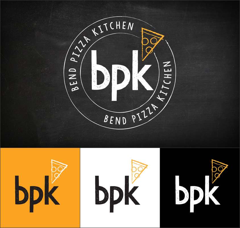
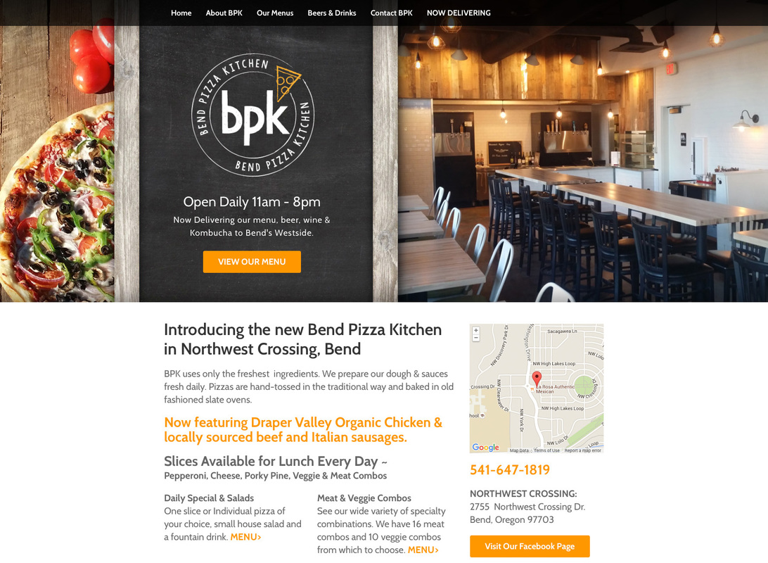
Bend Pizza Kitchen recently renamed their pizzeria, formerly known to locals and customers as Martolli's Pizza. The new name came with an ownership change and a new vision for the pizza establishment. BKP owner Robert Eisenberg approached Kinetic Branding to design their new logo and restaurant website. Kinetic discovered the unique Brand Energy Elements for BPK, which are: 1) Discovery, 2) Belonging and 3) Fun. With this distinct Brand Energy Formula, Kinetic developed the following logo and website designs. ABOVE: New Bend Pizza Kitchen logo and the BPK mark. ABOVE: New Bend Pizza Kitchen website. Visit website >
|
kinetic blogThis blog is focused on our latest projects. Find a category below for specific types of design projects or look through our blog archives. categories
All
archives
February 2024
|

