|
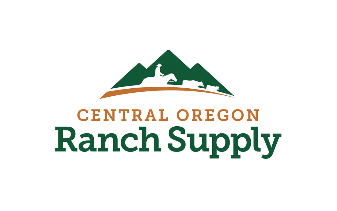
In logo redesign, there's an "evolutionary" and "revolutionary" approach for company's seeking an updated company logo. Central Oregon Ranch Supply decided that they desired a substantial and modern logo redesign which would imply that they wanted a revolutionary logo redesign, but they also wanted to make sure that their long-established brand recognition was not ignored, which called for an evolutionary logo redesign. Kinetic Branding made sure to accurately balance the needs of their client. Kinetic Branding wanted to make sure they designed a "logo" and not an "illustration" when approaching the logo redesign. Many companies start out with a logo that looks more like a complex illustration rather than a simplified and well-designed logo that emits instant recognition.
The original logo was a complex illustration with a rancher on horseback with seven head of cattle. The principles of successful logo design is to simplify, with the mantra "less is more." Major companies like UPS, Starbucks, FedEx, Apple and Microsoft all redesigned their corporate logos by simplifying the original design. Balancing the subtleties between evolutionary and revolutionary logo redesign, Kinetic decided that a limited display of rancher and cattle silhouettes could work as a reverse (or negative) image within a modern mountain-scape to maintain long-standing recognition. But Kinetic also realized that a simplified logo shape and a modern typeface would create the perfect balance between an evolutionary and revolutionary logo redesign. Stay connected to this blog for the C.O.R.S. website design. Kinetic has updated their newly launched website with two new case studies, which they call "Client Stories." These client stories present the problems our clients had and the solutions we created for them. One client story, for Nurturals, focuses on a totally new cleaning product company, where Kinetic implemented their Brand Energy brand strategy, named the company, products, designed the company logo, website and product labels. View the Nurturals Client Story > Another client story, for Steakhouse Elite, shows how Kinetic rebranded a young company into a solid, confident and credible beef brand. Kinetic discovered the Brand Energy Formulas for not only the company, but each other their three product lines, developed logos for the company and product lines, developed their robust website, designed product labels and more. View the Steakhouse Elite Client Story >
Kinetic Branding recently completed a logo design for a European fashion brand called Sì Amore (translated "yes love"). Kinetic designed a heart right into the logo using the top half of the lowercase 's' and 'a' letters. The new logo design is simple yet sleek, fashionable yet fun, and classy yet creative. The small circles at the end of the letters make the design ornate and attractive for women to wear on fashion apparel.
|
kinetic blogThis blog is focused on our latest projects. Find a category below for specific types of design projects or look through our blog archives. categories
All
archives
June 2024
|

