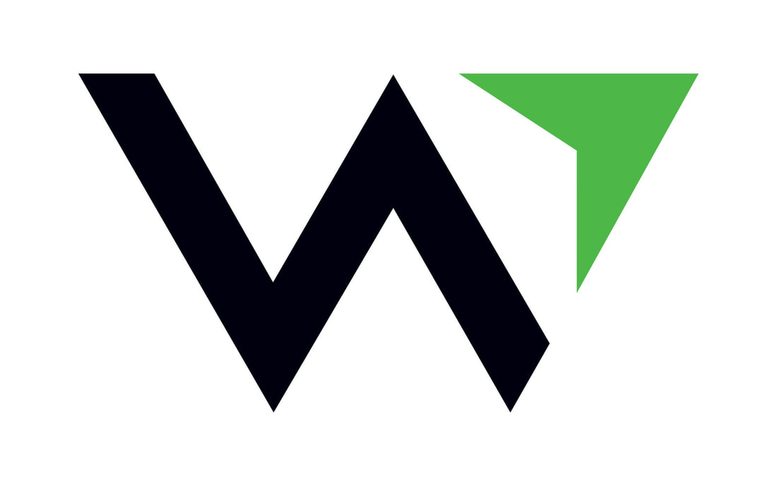
Kinetic designed this new logo, based on the new name "WealthEstate.law," with a purpose to give Paul's clients a sense of confidence and direction that would lead to financial success.
The new logo design features a "W" logo mark design, which of course stands for "WealthEstate.law." The logo and its mark has a compass-like feel that communicates financial direction upwards and forwards.
Stay connected to this blog for more WealthEstate.law projects Kinetic Branding recently designed a logo for Royal Flush Plumbing, a new plumbing company that aims to treat its customers like royalty. This logo design is more fun and illustrative by design, featuring a playing card-like illustration of a king holding a plumbing wrench instead of a sword. He's also sitting on his "throne" for some fun bathroom humor and a play on the name of the company. 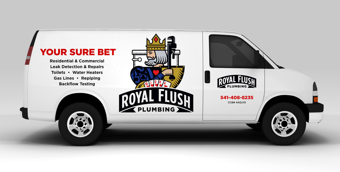 Kinetic also designed the vehicle graphics for Royal Flush Plumbing with the "Your Sure Bet" campaign theme. Stay connected to this blog to see more Royal Flush Plumbing designs.
Kinetic Branding recently completed the logo for startup, TubularTV, which provides video creators a platform to upload and sell their videos directly to consumers in an online marketplace. User videos are instantly monetized and can be embedded into any website platform. Kinetic also named TubularTV. It was originally described as an extremely cool and fast way for video creators to sell their content directly to consumers. Kinetic decided to take off on the vibe of the word "cool." The word "tubular" is still cool and with the addition of "TV" there is the "t-t" alliteration that helps people recall the name in their heads. As with all company naming projects, Kinetic makes sure the .com domain is available either exactly as named or something very close. In this case, Kinetic was able to secure the TubularTV.com domain name for the client.
Stay connected to this blog to see more TubularTV designs.
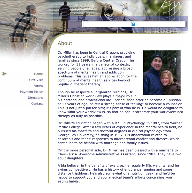
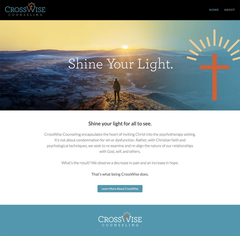
There could not be a more "night-and-day" contrast in design with Scott Miller's new brand identity "CrossWise" for his counseling business and the new website design and Brand Story Theme.
The old design (on the left/top) focuses on "the person" rather than a company and their unique brand identity offering.
Kinetic directed the company to focus on providing their clients with hope and fulfillment through faith. Kinetic brought an epic new look to the industry and provided a way for customers to connect to a vibrant message. The old website was not mobile-friendly and did not have search engine optimization (SEO) functionalities. Visit the new CrossWise Counseling website > Scott Miller is a Christian-based counselor who uses faith and common sense to help people shine the light they have within them and to find the joy and abundance that they are meant to have. Kinetic Branding recently completed the following logo that sets his counseling company apart from the rest of the counseling community and connect with people who are looking for a unique path to happiness. The newly created company name and logo design incorporates the theme "Shine your Light" and the association of Christianity into the typeface for CrossWise Counseling.
James Madison, a career, professional and business coach, approached Kinetic Branding to help name and design a logo for his new coaching business that helps people find their unique purpose in life.
In partnership with James, Kinetic named the company OnPurpose Life, a name that encapsulates the essence of living life with a laser-focused life of doing things on-purpose.
The logo design incorporates an archery target with an arrow in the bullseye to communicate the company's precise aim and determination in helping people find their purpose in life and make their mark on the world. Stay connected to this blog for the upcoming website design. Kinetic Branding recently named and designed a new corporate logo for a non-profit parenting organization that equips parents to guide their children and form a stronger 1-to-1 relationship of love and trust. This newly formed non-profit parenting organization needed a new name and corporate logo that encapsulated their core methodologies based on a 1-1 connection. Kinetic named the organization "The 1-1 Parenting Principle," or simply "1-1," based on this breakthrough parenting principle. The 1-1 Parenting Principle states that every 1 second a child is not listening to their parent, the parent receives 1 minute of personal restorative time in order to be a healthy parent raising a healthy child. This consequence-based parenting method gives the child safe boundaries and gives the parent the energy to do their job right, all while bonding them together.
See The 1-1 Parenting Principle website > Kinetic Branding believes that we are all equally worthy not based our color. We designed this "Human1ty" logo as a unifying brand for humanity. We believe that we are unique in our beings, yet we have equal human rights to life, liberty and the pursuit of happiness.
Kinetic Branding recently completed the naming and logo redesign for Encompass Cleaning, a full-service cleaning company.
The original company, Katie's Cleaning, decided to expand their services to all types of cleaning, not only for residential but also commercial cleaning. With such a drastic change in scope, the company needed a new name and logo that better represented the company's new direction.
Kinetic renamed the company "Encompass Cleaning" because they now provided all manner of cleaning services for all types of homes or buildings. And the new logo mark resembles an "e" made from four arching shapes. This new logo type is called an "integrated logo design" whereby it integrates a unique logo mark within the text of the logo. This logo mark can be used on it's own or within the logotype, making the logo very versatile. The mark can easily be placed on shirts and hats as shown above.
Kinetic recently designed a new logo for a business, Upcycle Initiative, a consultancy for sustainable waste diversion initiatives designed to promote integrated environmental solutions that increase resource recovery activities and reduce the need for conventional landfill disposal. READ MORE >>
|