|
Kinetic Branding is highlighting its latest branding endeavors for their long-time client, RDD, an innovative aircraft manufacturing business. In this Part 1 of "A Brand Journey," we're tracking with RDD, who approached Kinetic to develop a new name, logo, website and a few other projects for their upcoming new 2022 aircraft.
CLIENT & PROJECT BACKGROUND: RDD Enterprises is a premiere aviation Research, Design & Development group with a rich aviation heritage serving the experimental aircraft community. RDD has provided technologically-advanced aircraft systems and world-class support to pilots and their airplanes for more than a decade. In early 2016, RDD made huge headlines when they transformed the iconic Lancair IVP into their own LX7 aircraft by designing and replacing the nose, cowling, wings and tail. The LX7 became one one of the safest, fastest, most efficient and most luxurious aircraft in its class. The LX7 was wildly successful, setting new personal and world records for a single engine aircraft. Among a long list of innovations, the LX7 could also fly across the continental US on just one tank of fuel. The demand for the LX7 grew quickly and RDD soon found itself innovating again. At the beginning of 2022, RDD is once again poised to make historic headlines with their successor to the LX7. This time around they are positioned to design and manufacture the next new aircraft entirely within the company, without a donor airplane. RDD wanted to explore a new name and logo for the next model, which internally they referred to it as "LX8." With the amount of innovation that went into the creation of the new aircraft and the improvements on its power and performance, an incremental name change from LX7 to LX8 would not do this game-changing aircraft any justice. Kinetic Branding has been working together with RDD since the early days of the company, designing the LX7 logo and website, among other things. New Aircraft Naming: As mentioned before, naming the new aircraft "LX8" after it's predecessor, the LX7, didn't make sense with such a monumental leap forward. The LX7 stood on it's own and RDD did not have predecessors called LX6, LX5 and so forth. At the same time, Kinetic and RDD equally loved the LX7 name and story behind it, not to mention "LX7" sounds cool, and the logo Kinetic designed for it was equally cool. The new aircraft name would have to work along side the LX7 aircraft name as well as future new aircraft that RDD would build. Kinetic wanted a name that is congruent with the brand story that they've been building with RDD over the past years. Kinetic wanted to continue building upon the brand equity from LX7. So what was the final name? The winning name for the new aircraft was not to replace the "7" with an "8." Kinetic recognized that RDD actually turned everything on it's side with this next innovative model, that they took the "8" in LX8 and literally turned it on it's side to create the infinity symbol. The LX8 would be called the LX∞ (LX-Infinity). Kinetic and RDD agreed that this aircraft design had an infinite amount of innovation that it needed a name that matched. PROJECT SOLUTIONS: Kinetic Branding and RDD established the first set of projects which is covered in this Part 1 of "A Brand Journey." The main projects include:
New Aircraft Campaign Theme: Five years ago, Kinetic Branding developed the campaign theme "Relentless Innovation" for the LX7. Relentless Innovation epitomized the essence of RDD and their work to create the pioneering LX7 aircraft. As with the new LX∞ name, a newly altered campaign theme needed to be created, yet it needed to retain the Relentless Innovation feel. Kinetic created the new "Innovation to the Power of Infinity" campaign theme for the LX∞ aircraft. New Aircraft Logo Design: With the new LX∞ name so close to the LX7, the logo design treatment was determined to be treated very similarly, with a chiseled metallic design.
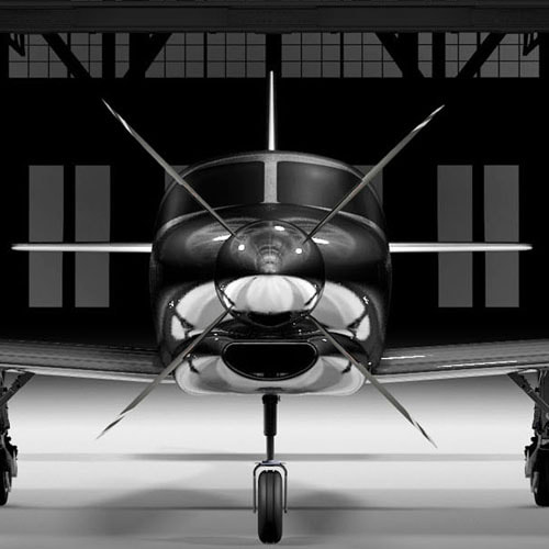
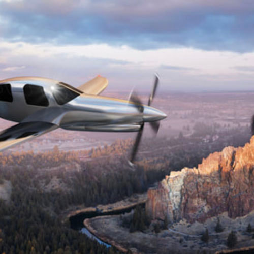
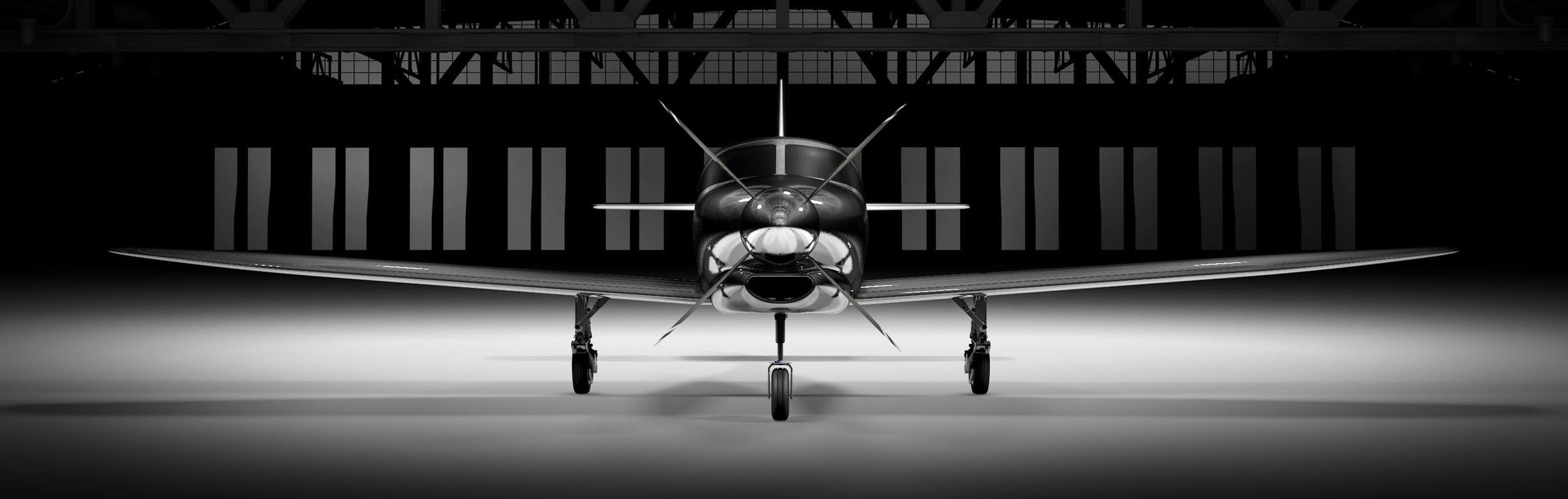
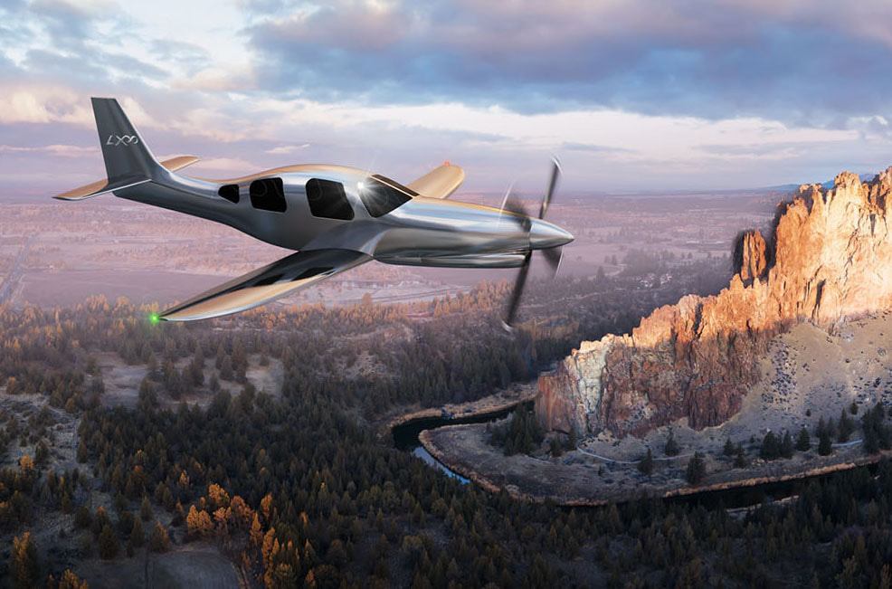
The infinity symbol of the LX∞ logo extends from the top-right arm of the "X" to begin forming it's shape, and it ends tucked nicely back into the cross bars of the "X." The infinity symbol also rises slightly above the top of the "L" and the "X" to not only give the "X" more strength, but to give the infinity symbol the feeling of being an exponential–which would tie in with the campaign theme "Innovation to the Power of Infinity." New Aircraft Website Design: Once the new name, campaign theme and logo were developed, Kinetic Branding began working on the LX∞ website at www.lxaircraft.com. The new website sports a large-scale slideshow, statistic counters, image galleries and much more. The website also carried the "Innovation to the Power of Infinity" campaign theme and brand story. 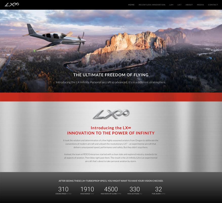 Presenting the LX∞ on the new website was a bit of a challenge as the first LX∞ had not yet been built and therefore no images of the aircraft. Although it had not been built yet, the aircraft was designed by RDD in 3D. Kinetic branding was able to take the 3D aircraft designs and make stunning renderings in order to show the public what the LX∞ will look like. Click on the images below to enlarge.
This concludes Part 1 of "A Brand Journey." Kinetic and RDD are working closely on more monumental branding projects that will help position the company and its innovative aircraft as leaders in the industry.
Stay connected to this blog for "A Brand Journey – Part 2" Kinetic Branding recently completed a product naming and product logo design project for a new experimental single engine aircraft for RDD Enterprises, an aircraft manufacturer located in Redmond, Oregon. Back in May of 2017, Kinetic designed a logo and other brand identity projects for the company's first-ever semi-manufactured aircraft, the LX7 (shown below). It was RDDs foray into aircraft design, and it was a major hit. The LX7 outperformed all expectations, winning multiple aviation records, and Kinetic Branding was there to tell the unique amazing brand story.
Recently, RDD developed an even more innovative airplane, designing the entire aircraft completely in-house and adding more than two dozen new features. The new aircraft needed a new name and logo, but simply calling it the "LX8" would do this innovative machine an injustice.
Kinetic developed the new name, the “LX∞” (LX-Infinity), and designed the new logo (shown above). The new name and logo had to be related to one another, yet the new aircraft name had to also separate itself significantly from its predecessor. Stay connected to this blog to see much more of the new LX∞ aircraft. |