Kinetic Branding

  • Home
  • Brand Energy
    • Brand Energy Elements
    • Brand Energy Formula
    • Brand Energy Analysis
  • Portfolio
    • Logo Design
    • Web Design
    • Print Design
  • Client Stories
    • BioEnergy Hawaii
    • Maragas Winery
    • Noble Insurance Solutions
    • Nurturals
    • Steakhouse Elite
    • Window Alert
  • Blog
  • About
  • Contact

Designing A Valued Brand

2/2/2024

 
Kinetic Branding recently completed a rebranding effort for attorney Paul Heatherman who sought to turn his personal brand into a corporate brand. With a new company name and the matching domain name, WealthEstate.law, Paul decided to capitalize on that great name with a great logo design.
Old Paul Heatherman logo
OLD LOGO DESIGN
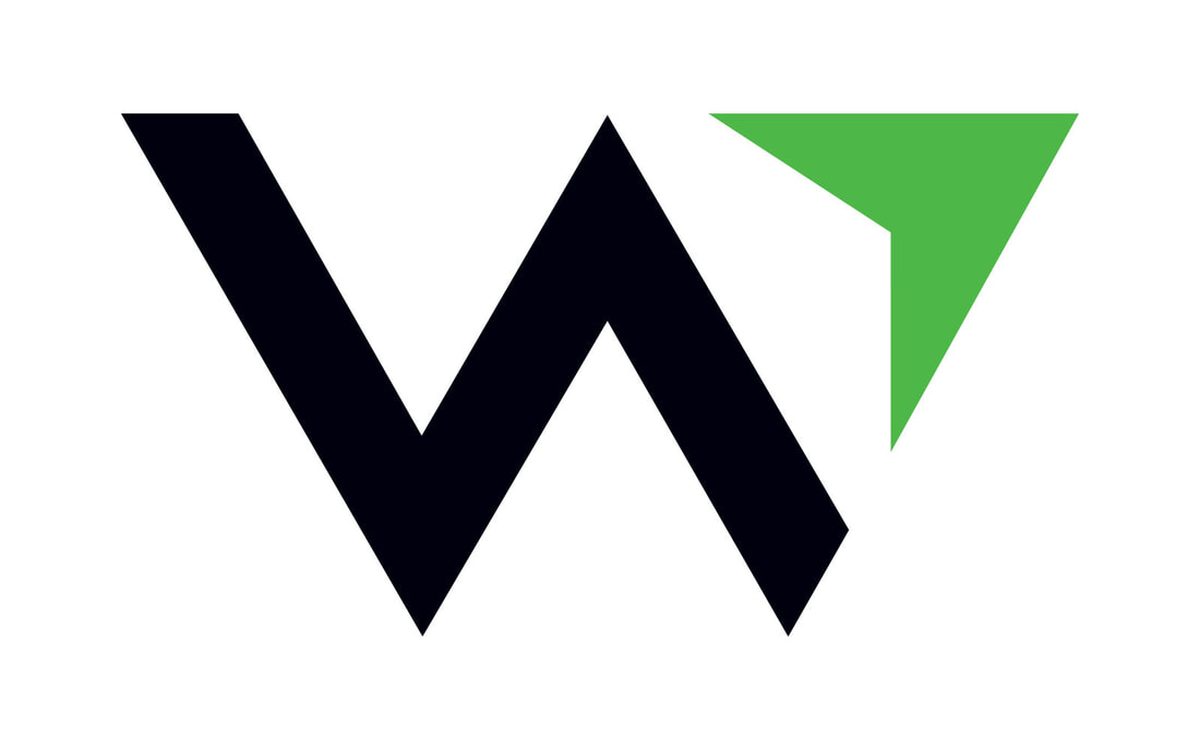
Kinetic designed this new logo, based on the new name "WealthEstate.law," with a purpose to give Paul's clients a sense of confidence and direction that would lead to financial success.
Wealth Estate Logo positive
Wealth Estate Logo reverse
Wealth Estate Logo Mark
The new logo design features a "W" logo mark design, which of course stands for "WealthEstate.law." The logo and its mark has a compass-like feel that communicates financial direction upwards and forwards.

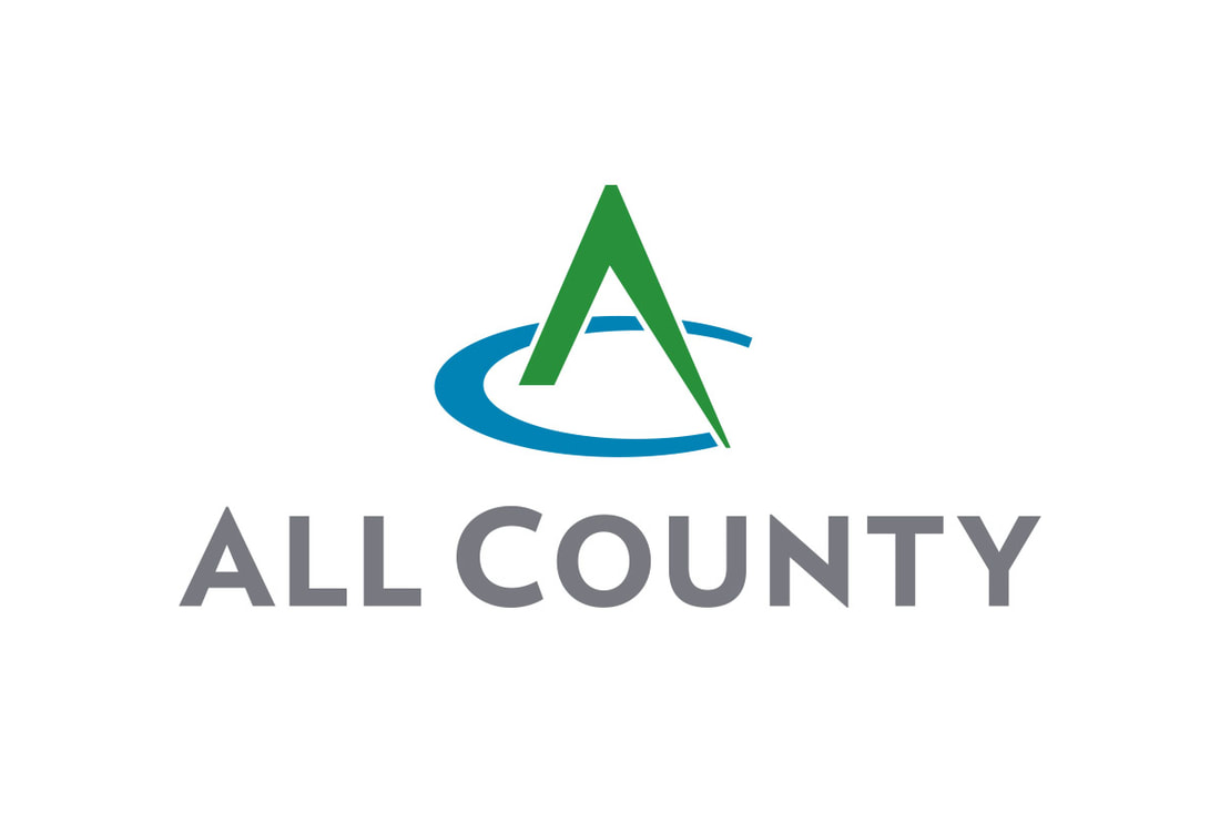
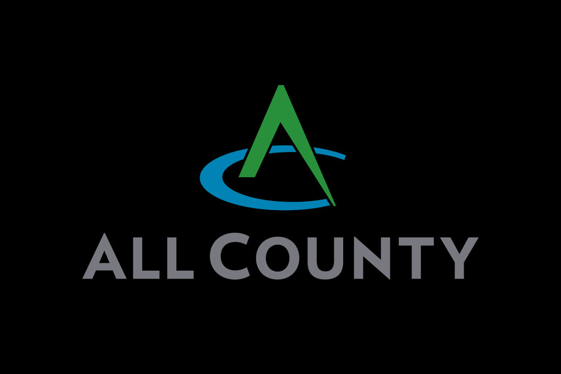
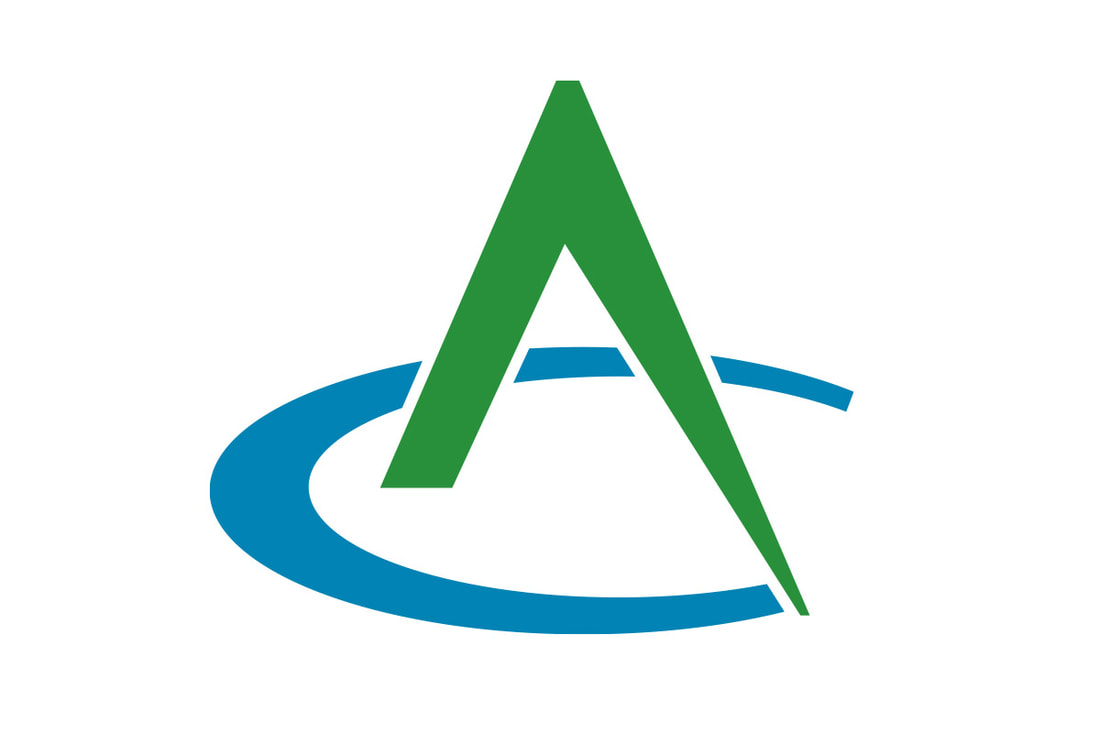
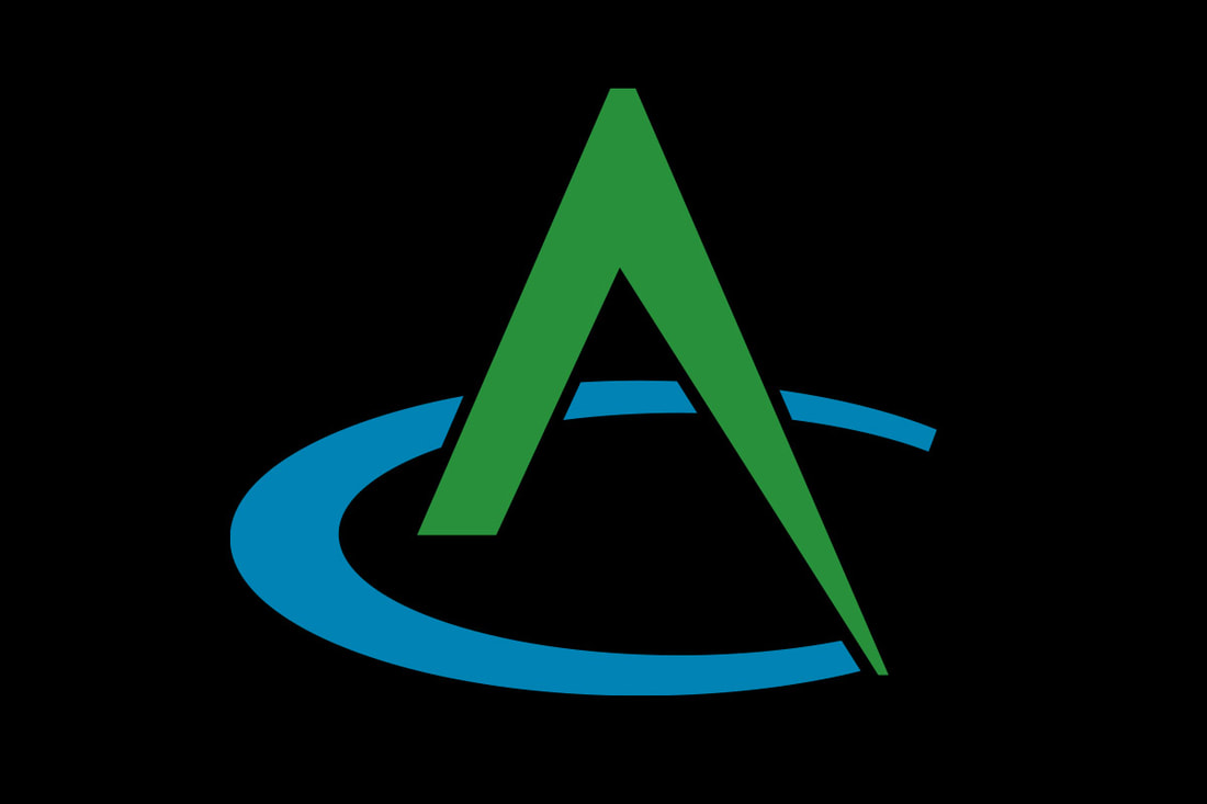
Stay connected to this blog for more WealthEstate.law projects

Letters & Logo Marks

7/21/2023

 
Kinetic Branding has redesigned a new logo for All County, a surveying, planning and engineering firm from Northern Oregon. The new logo design is shown below. Tap on the logos below to see larger versions.
All County Logo
All County Logo
All County Logo Mark
The new All County logo design focuses on the letters “A” and “C” (which stand for “All County”) to create a unique, bold and creative mark that captures the essence of what the company provides to their clients.

The “A” represents an engineering compass instrument that has traditionally been used to draw circular shapes, which in this case draws a “C” shape, to capture the logo mark design. The compass (the letter “A”) appears to be actively drawing a semicircle (the letter “C”).

A hidden gem in the logo design, the compass ("A") could be viewed as a forested mountain peak and the semi-circle it draws ("C") could be considered a lake. Since the company is located in the Pacific Northwest, mountains and lakes are a prominent presence in the area.

The old logo design (below) had many versions, which created inconsistencies and weakened the overall brand recognition to consumers.
Picture
Picture
Stay connected to this blog to see the upcoming design for All County's  new corporate website.

The Art Of Logo Redesign

3/30/2022

 
Kinetic Branding has completed the redesign of a personal logo for master artist and oil painter Donald Yatomi.
Redesigned Donald Yatomi logo
Kinetic designed the original logo for Yatomi many years ago based on the artist's unique signature. Over time, his signature slowly changed, making it necessary to redesign his personal logo.
Original Donald Yatomi logo
ORIGINAL LOGO DESIGN BY KINETIC
As mentioned, the redesigned logo mark is based on the artists' new personal signature found in the corner of all his paintings. With the more dynamic and stylistic signature, the text for the logo could not be  positioned symmetrically like the original logo.

Let’s Be Frank

7/4/2021

 
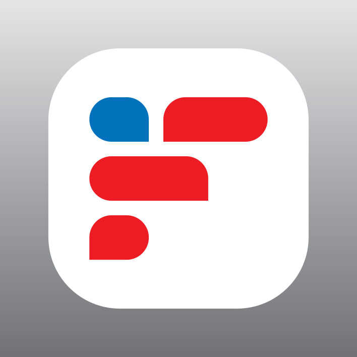
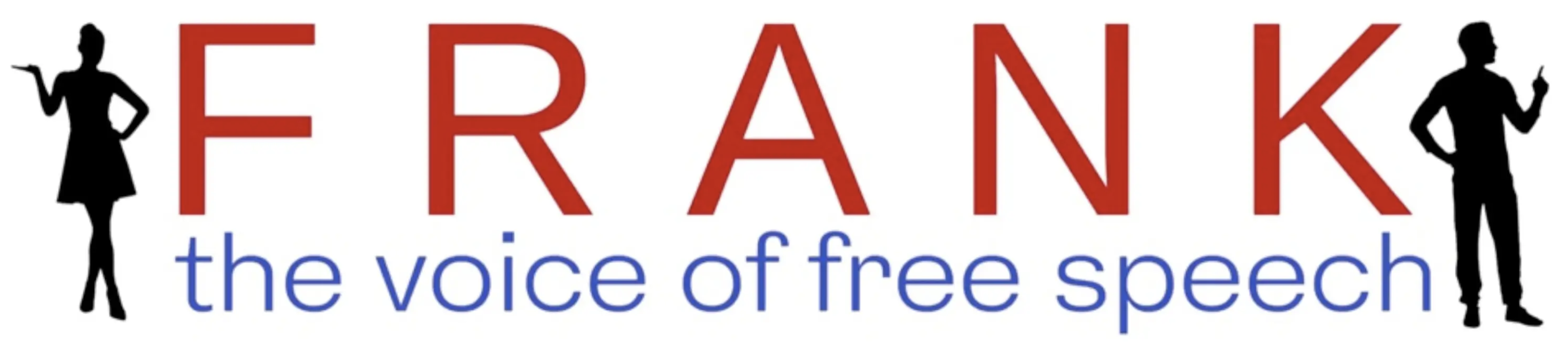
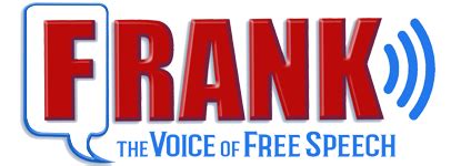
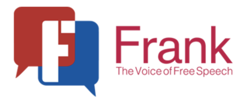
Kinetic Branding is working with a new startup social media platform to give the organization a legitimate presentation to the American audience.

We love design. We love branding. We love to communicate the core felt needs of a company to their consumers. We felt that the logo they initially designed did not accurately communicate the core values of the company, so we offered an alternative approach.
Frank Speech logo mike lindell
Frank is a social media platform that allows users to voice their first amendment free speech and express opinions without fear of being cancelled.

The logo mark designed by Kinetic is in the shape of an "F" for Frank. The "F" is also made up of red and blue talk bubbles representing a dialog. And finally, the red and blue talk bubbles represent the American flag which stands in part for free speech.

The logos shown below are the company's various attempts at a logo design for the new online business.
old logo design
logo design
logo design

A Logo That Reaches New Heights

4/9/2021

 
Kinetic Branding recently updated a logo for Cascade Security, a security company, by simplifying the design and making a memorable brand identity.
New Cascade Security Logo
The new Cascade Security logo takes the original concept of a mountain range and minimizes the details of the visual element so it's more memorable and recognizable.
Picture
OLD LOGO DESIGN
The new logo maintains a similar brush stroke design style, while minimizing the design and better reflecting the local mountain terrain.

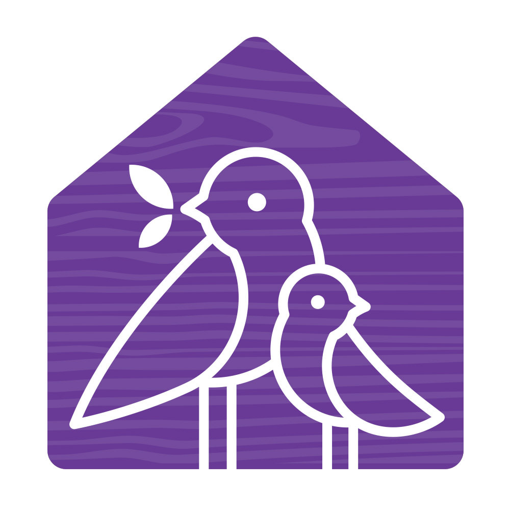
Stay connected to this blog for the Cascade Security website update.

A Logo People Are Flocking To

11/27/2020

 
Kinetic Branding recently completed a logo redesign for Family School International, a non-profit parenting organization that aids parents in establishing a framework that will help their families operate more smoothly, so that all members can feel confident, satisfied and hopeful.
Family School logo
Family School logo mark
Family School's original logo focused on a bird theme that represented a family in a flock formation and a schoolhouse, but it was a bit overly illustrative and too literal in its design approach.

Kinetic focused on a simplistic, yet family-oriented design, of an intimate and nurturing parent-child relationship represented using a bird theme to represent a family.
Old Family School logo
ORIGINAL LOGO
One of the organization's core Brand Emotions is "Nurturing," which is a desire of a parent to engage in products and services that benefit their children. Kinetic focused on this emotion for their logo design showing the gentle and loving relationship between the parent and baby bird.

Stay connected to this blog for Family School's upcoming website redesign.

Rebuilding A Home Builder Brand

1/28/2020

 
Kinetic Branding recently completed a new logo design for KD Construction Services, an Oregon home builder. Prior to designing the logo, Kinetic proposed the shorter DBA name "KD Homes" which the client liked. By using "Homes" instead of "Construction Services," the name accurately reflects what they build and it's easier to remember and write out. 
Picture
The new logo design is much more simplistic and memorable than the old logo, which was a bit more intricate and illustrative. The old illustration reflects only one style of house, but the company builds all types of homes. Prospective clients could see the logo and think that the company only builds that one type of home.
Picture
OLD LOGO
With a pleasant and warm green and dark walnut-brown color combination and a shorter name, the company's new logo says more visually about their craftsmanship and quality than the old logo could.

Remodeling A Brand

9/5/2019

 
Kinetic recently completed a rebranding project for Norman Building & Design, a high-end custom home building and remodeling company. (Click on the images below to see a larger version)
Norman Building & Design Logo

The old logo (shown here) was the company's long-established logo from their 1977 founding. The goal in updating this 42-year-old logo was to not only make it modern, but also to ensure that the logo would last the test of time. 
Old Norman Building & Design Logo
ORIGINAL LOGO
Kinetic redesigned the Norman logo in a simplistic and elegant fashion. The new logo picks up a color palette of the materials Norman Building & Design uses in their custom home designs. The two triangles and rectangle creates a negative "N" shape that stands for Norman.

Building A Great Pyramid Logo

8/21/2019

 
Pyramid Heating & Cooling Logo
Kinetic Branding recently completed a new logo design for Pyramid Heating & Cooling in Portland, OR. Pyramid contracted Kinetic to completely rebrand the company.
Picture
OLD PYRAMID LOGO
The old Pyramid logo was originally designed based on the Egyptian pyramids in the desert, but really had nothing to do with heating and cooling a home. The company sought not only a new brand identity design, but one that was meaningful and would connect with homeowners. 

The new logo identity design has colors that represent the warm and cool temperatures that the company provides control of homeowners, The new pyramid design no longer is an ancient ruin, but a modern and powerful symbol that captures attention and creates interest in the company. 

Stay connected to this blog for more brand identity designs for Pyramid.

A Bighearted Logo Design

12/27/2018

 
What If We Could logo mark
What If We Could Logo
Kinetic Branding has recently completed a pro-bono logo design for a startup non-profit organization, "What If We Could?," a crowd-sourcing platform designed to showcase mini projects of local non profits, giving a glimpse into their activity in the community and allow the public to better connect.

Kinetic partnered with What If We Could? to redesign their logo in a more meaningful way, using the Kinetic Brand Energy process that uncovers the emotional reasons behind why people connect with companies.
The original logo (shown here) was meant to convey a community of people coming together, however, the old logo was colorless and cold in it's design. The old logo mark highlighted a network of people, but it looked a lot like a snowflake.
Old What If We Could logo
OLD WIWC LOGO
The new logo that Kinetic designed shows people holding hands and coming together for bighearted purposes. In the top-center area of the logo mark (shown here) a heart shape is created by the hands coming together. The different colors selected for the people blend to the same pink color in the center to emphasize the heart.
What If We Could Logo
NEW WIWC LOGO
<<Previous

    kinetic blog

    This blog is focused on our latest projects. Find a category below for specific types of design projects or look through our blog archives.

    categories

    All
    3D Modeling
    Advertisement
    App Design
    Brand Strategy
    Brochure Design
    Business Cards
    Campaign Theme
    Client Stories
    Company Naming
    Logo Design
    Logo Redesign
    Packaging Design
    Personal
    Poster Design
    Product Logo Design
    Product Naming
    Stationery
    User Interface Design
    Vehicle Wrap
    Video Branding
    Website Design

    archives

    January 2025
    December 2024
    November 2024
    October 2024
    September 2024
    August 2024
    July 2024
    June 2024
    May 2024
    April 2024
    March 2024
    February 2024
    January 2024
    December 2023
    November 2023
    October 2023
    September 2023
    August 2023
    July 2023
    June 2023
    May 2023
    April 2023
    March 2023
    February 2023
    January 2023
    December 2022
    November 2022
    October 2022
    September 2022
    August 2022
    July 2022
    June 2022
    May 2022
    April 2022
    March 2022
    February 2022
    January 2022
    December 2021
    November 2021
    October 2021
    September 2021
    August 2021
    July 2021
    June 2021
    May 2021
    April 2021
    March 2021
    February 2021
    January 2021
    December 2020
    November 2020
    October 2020
    September 2020
    August 2020
    July 2020
    June 2020
    May 2020
    April 2020
    March 2020
    February 2020
    January 2020
    December 2019
    November 2019
    October 2019
    September 2019
    August 2019
    July 2019
    June 2019
    May 2019
    April 2019
    March 2019
    February 2019
    January 2019
    December 2018
    November 2018
    October 2018
    September 2018
    August 2018
    July 2018
    June 2018
    May 2018
    April 2018
    March 2018
    February 2018
    January 2018
    December 2017
    November 2017
    October 2017
    September 2017
    August 2017
    July 2017
    June 2017
    May 2017
    April 2017
    March 2017
    February 2017
    January 2017
    December 2016
    November 2016
    October 2016
    September 2016
    August 2016
    July 2016
    June 2016
    May 2016
    April 2016

Kinetic Branding Logo
541.848.7749
Home

Blog


About


​​Contact
Brand Energy
Brand Energy Elements
Brand Energy Formula
​
Brand Energy Analysis
Portfolio
Logo Design
Web Design
​
Print Design
Client Stories
BioEnergy Hawaii
Maragas Winery
Noble Insurance
Nurturals
​Steakhouse Elite
​
WindowAlert
Email Icon
LinkedIn Icon
©2023 Kinetic Branding
​
Web Design by Kinetic
​Powered by WebBlox