|
Kinetic Branding is developing a website for the quaint vacation destination of Bayshore Beach Club in Waldport, Oregon. The website (shown below) highlights the amazing beauty and attractions you can experience.  Kinetic not only took amazing photos of the amazing coastal community and wrote key content for the website, but the company crafted a campaing theme for the community titled "Discover your Coastal Retreat."
Kinetic Branding recently crafted a logo for Volcano Arcades, a new retail company specializing in 80s retro arcade games. This arcade boasts over 100 classic pixelated games, including favorites like Pac-Man, Donkey Kong, Galaga, Frogger, Tempest, Tron, and Mario Bros., among many others. Click on images below to enlarge
The logo design features the initials of Volcano Arcades, with the "A" creatively depicted as a volcano erupting pixels into the air, an homage to the pixelated 80's arcade games. The color scheme includes vibrant lava hues, complemented by dark grey text to create a balanced and striking visual appeal. Displayed above is the logo design in a vertical and horizontal orientation as well as the logo mark by itself.
Kinetic also created a tagline and campaign theme for the new company titled "A Blast From The Past" referencing the name "Volcano" and the retro 1980s arcade games the company provides. Stay connected to this blog to see the upcoming website design. In the realm of estate planning and wealth management, the journey often transcends mere financial transactions. It's about crafting legacies that endure through generations, leaving an indelible mark on the world. This essence forms the cornerstone of WealthEstate.law's latest campaign created by Kinetic Branding: "Elevating Legacies, Increasing Wealth." The campaign encapsulates a vision of empowerment, where individuals are guided not only in preserving their wealth but also in nurturing it to new heights. It's a holistic approach that recognizes the interplay between financial assets and the intangible elements that define a family's heritage. At the heart of this campaign lies a commitment to innovation and distinction. Kinetic has unveiled a striking new logo and business card design that embodies the WealthEstate.law ethos. 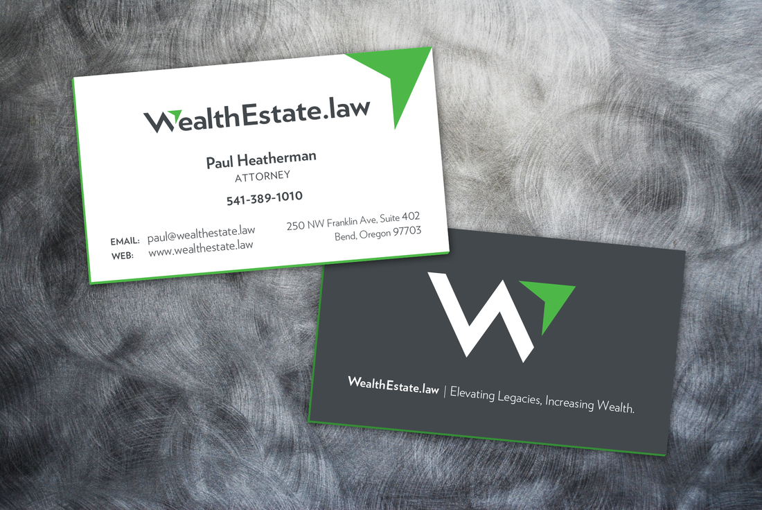 The Front Design: The front of the business card features the newly designed WealthEstate.law logo, a symbol of trust and expertise in the field of estate planning. However, what catches the eye is the addition of a vibrant green arrow in the top-right corner. This arrow isn't just a decorative element; it's a symbol of progress and upward mobility. It signifies WealthEstate.law's dedication to propelling its clients towards greater financial success and security. The card edges are painted green to accentuate the primary brand color.
The Back Design: Flipping over the card reveals a sleek, dark gray background adorned with the WealthEstate.law logo mark. This minimalist backdrop serves to accentuate the campaign theme text, "Elevating Legacies, Increasing Wealth," which is boldly emblazoned across the center. The contrast between the dark hue and the crisp white text exudes sophistication and professionalism. Symbolism and Significance: Every element of the business card design has been meticulously chosen to convey a message. The green arrow symbolizes growth and prosperity, while the dark gray backdrop exudes a sense of stability and trustworthiness. Together, these elements encapsulate the essence of WealthEstate.law's mission: to guide clients towards a future where their legacies flourish and their wealth knows no bounds. Conclusion: In unveiling their new campaign theme and business card design, WealthEstate.law reaffirms its commitment to excellence in estate planning and wealth management. It's not just about preserving wealth; it's about nurturing it, cultivating it, and ensuring that it becomes a lasting legacy for generations to come. With the guiding beacon of the green arrow, clients can embark on a journey of financial empowerment, secure in the knowledge that their legacies are in expert hands. Kinetic Branding recently designed a logo for Royal Flush Plumbing, a new plumbing company that aims to treat its customers like royalty. This logo design is more fun and illustrative by design, featuring a playing card-like illustration of a king holding a plumbing wrench instead of a sword. He's also sitting on his "throne" for some fun bathroom humor and a play on the name of the company. 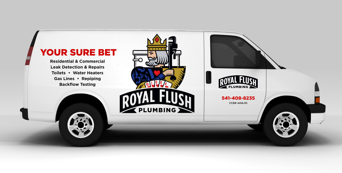 Kinetic also designed the vehicle graphics for Royal Flush Plumbing with the "Your Sure Bet" campaign theme. Stay connected to this blog to see more Royal Flush Plumbing designs.
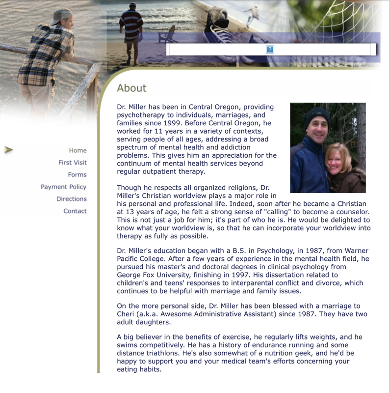
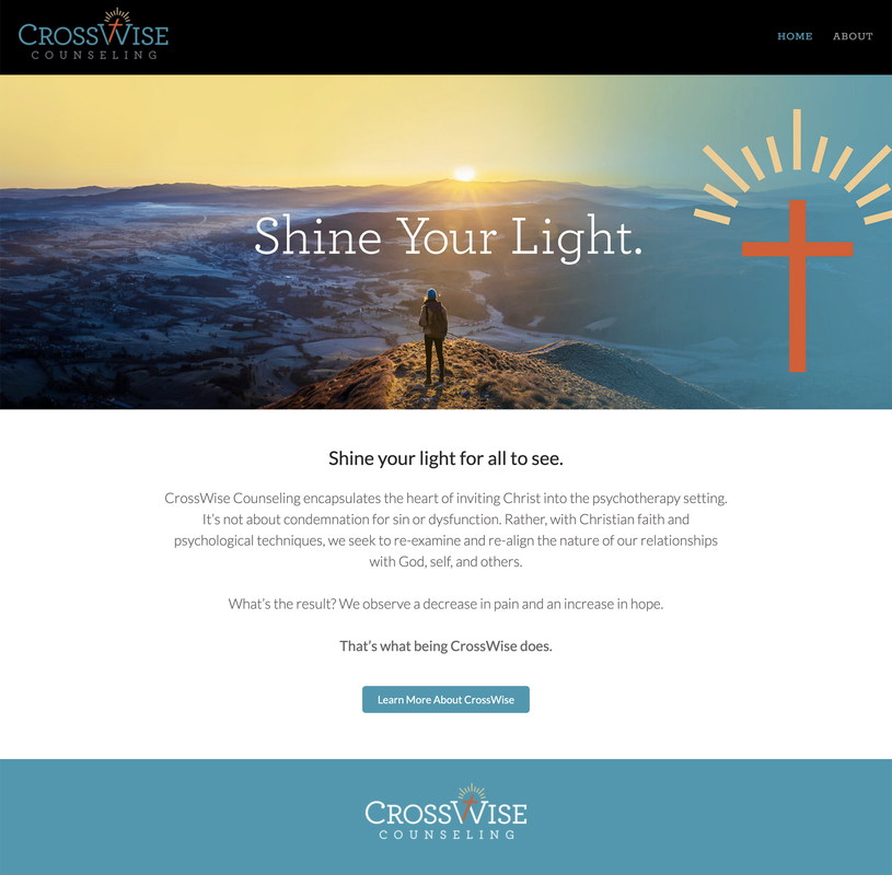
Kinetic Branding recently produced a radio ad for their sister company, WebBlox, a website team that creates and maintains custom websites with their own content management system that makes websites easy to maintain and control. The brand message is “Turn Your Website Woes Into Website WOWS!” and it is focused on the unique ability of WebBlox to create impressive websites that our clients will love and their customers will say, "WOW!" Below is the main 30-second ad created by Kinetic Branding, as well as the WebBlox website design based on the "Website WOWS!" campaign theme. 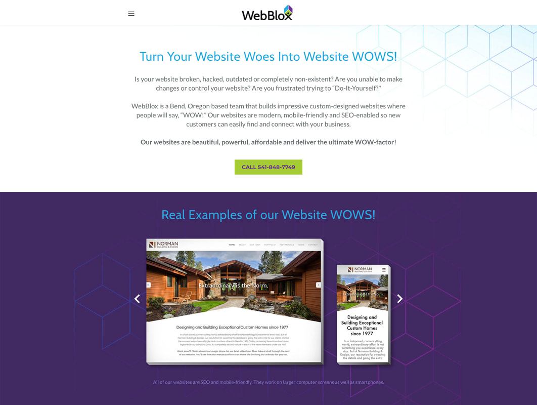 Kinetic Branding recently completed a new website design for longtime client, Maragas Winery. Kinetic has redesigned the company's logo, labels and now, their website with a new brand story, "Uncork The Tradition." Visit the new Maragas Winery website > 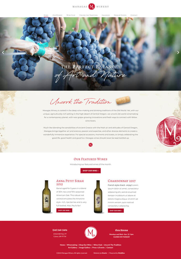 There could not be a more "night-and-day" contrast in design with Scott Miller's new brand identity "CrossWise" for his counseling business and the new website design and Brand Story Theme.
The old design (on the left/top) focuses on "the person" rather than a company and their unique brand identity offering.
Kinetic directed the company to focus on providing their clients with hope and fulfillment through faith. Kinetic brought an epic new look to the industry and provided a way for customers to connect to a vibrant message. The old website was not mobile-friendly and did not have search engine optimization (SEO) functionalities. Visit the new CrossWise Counseling website > Longtime client GLI Advisors wanted to update their brand image for 2023, but knew that a design upgrade in and of itself was not enough. They needed a Brand Story that would tap into the heart of their core audience. GLI is a high-level project management company that directs and develops community housing properties. Kinetic Branding developed a unique Brand Storyline theme — "Elevating Communities. Building Confidence." — that would tap into the primary felt need of "control" for their ideal clients. 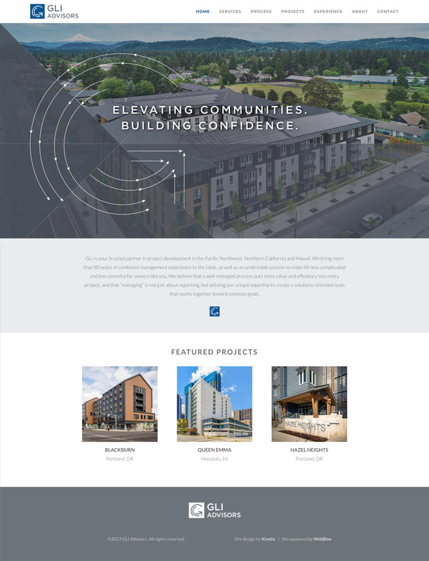 Kinetic visualized this Brand Storyline concept design with blueprint-like lines and arrows that speak to control and detailed planning. The lines and arrows circle images of the company's past projects in the shape of their G-shaped logo mark, thus creating a dynamic message that speaks to control, competency and countenance.
Visit the new GLI Advisors website > Scott Miller is a Christian-based counselor who uses faith and common sense to help people shine the light they have within them and to find the joy and abundance that they are meant to have. Kinetic Branding recently completed the following logo that sets his counseling company apart from the rest of the counseling community and connect with people who are looking for a unique path to happiness. The newly created company name and logo design incorporates the theme "Shine your Light" and the association of Christianity into the typeface for CrossWise Counseling.
Kinetic Branding is highlighting its latest branding endeavors for their long-time client, RDD, an innovative aircraft manufacturing business. In this Part 1 of "A Brand Journey," we're tracking with RDD, who approached Kinetic to develop a new name, logo, website and a few other projects for their upcoming new 2022 aircraft.
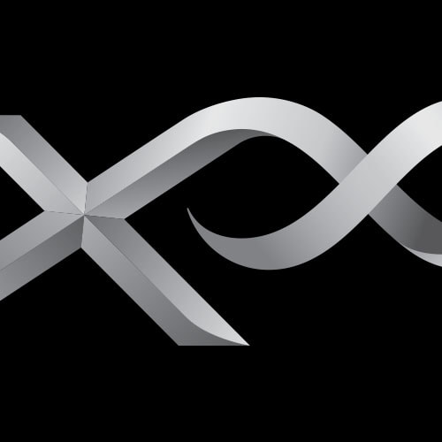
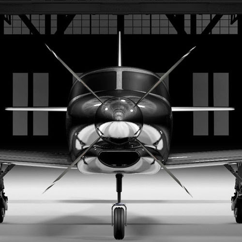
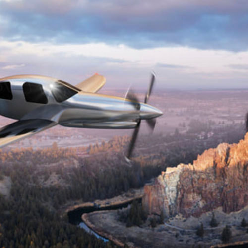
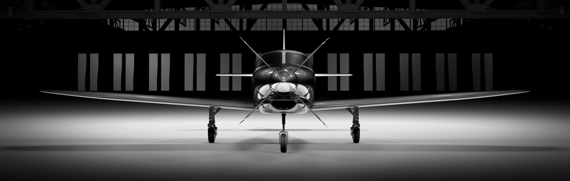
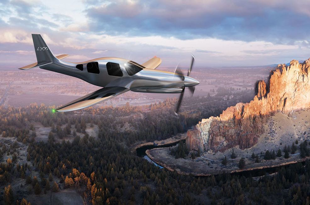
CLIENT & PROJECT BACKGROUND: RDD Enterprises is a premiere aviation Research, Design & Development group with a rich aviation heritage serving the experimental aircraft community. RDD has provided technologically-advanced aircraft systems and world-class support to pilots and their airplanes for more than a decade. In early 2016, RDD made huge headlines when they transformed the iconic Lancair IVP into their own LX7 aircraft by designing and replacing the nose, cowling, wings and tail. The LX7 became one one of the safest, fastest, most efficient and most luxurious aircraft in its class. The LX7 was wildly successful, setting new personal and world records for a single engine aircraft. Among a long list of innovations, the LX7 could also fly across the continental US on just one tank of fuel. The demand for the LX7 grew quickly and RDD soon found itself innovating again. At the beginning of 2022, RDD is once again poised to make historic headlines with their successor to the LX7. This time around they are positioned to design and manufacture the next new aircraft entirely within the company, without a donor airplane. RDD wanted to explore a new name and logo for the next model, which internally they referred to it as "LX8." With the amount of innovation that went into the creation of the new aircraft and the improvements on its power and performance, an incremental name change from LX7 to LX8 would not do this game-changing aircraft any justice. Kinetic Branding has been working together with RDD since the early days of the company, designing the LX7 logo and website, among other things. New Aircraft Naming: As mentioned before, naming the new aircraft "LX8" after it's predecessor, the LX7, didn't make sense with such a monumental leap forward. The LX7 stood on it's own and RDD did not have predecessors called LX6, LX5 and so forth. At the same time, Kinetic and RDD equally loved the LX7 name and story behind it, not to mention "LX7" sounds cool, and the logo Kinetic designed for it was equally cool. The new aircraft name would have to work along side the LX7 aircraft name as well as future new aircraft that RDD would build. Kinetic wanted a name that is congruent with the brand story that they've been building with RDD over the past years. Kinetic wanted to continue building upon the brand equity from LX7. So what was the final name? The winning name for the new aircraft was not to replace the "7" with an "8." Kinetic recognized that RDD actually turned everything on it's side with this next innovative model, that they took the "8" in LX8 and literally turned it on it's side to create the infinity symbol. The LX8 would be called the LX∞ (LX-Infinity). Kinetic and RDD agreed that this aircraft design had an infinite amount of innovation that it needed a name that matched. PROJECT SOLUTIONS: Kinetic Branding and RDD established the first set of projects which is covered in this Part 1 of "A Brand Journey." The main projects include:
New Aircraft Campaign Theme: Five years ago, Kinetic Branding developed the campaign theme "Relentless Innovation" for the LX7. Relentless Innovation epitomized the essence of RDD and their work to create the pioneering LX7 aircraft. As with the new LX∞ name, a newly altered campaign theme needed to be created, yet it needed to retain the Relentless Innovation feel. Kinetic created the new "Innovation to the Power of Infinity" campaign theme for the LX∞ aircraft. New Aircraft Logo Design: With the new LX∞ name so close to the LX7, the logo design treatment was determined to be treated very similarly, with a chiseled metallic design.
The infinity symbol of the LX∞ logo extends from the top-right arm of the "X" to begin forming it's shape, and it ends tucked nicely back into the cross bars of the "X." The infinity symbol also rises slightly above the top of the "L" and the "X" to not only give the "X" more strength, but to give the infinity symbol the feeling of being an exponential–which would tie in with the campaign theme "Innovation to the Power of Infinity." New Aircraft Website Design: Once the new name, campaign theme and logo were developed, Kinetic Branding began working on the LX∞ website at www.lxaircraft.com. The new website sports a large-scale slideshow, statistic counters, image galleries and much more. The website also carried the "Innovation to the Power of Infinity" campaign theme and brand story. 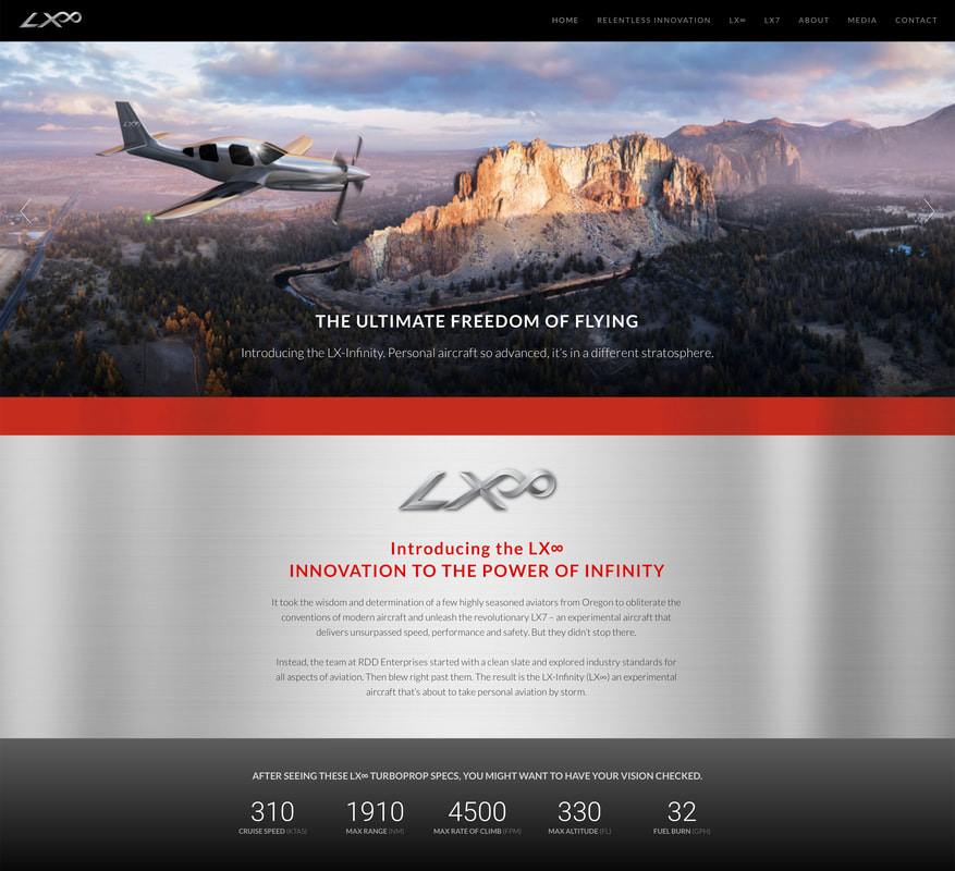 Presenting the LX∞ on the new website was a bit of a challenge as the first LX∞ had not yet been built and therefore no images of the aircraft. Although it had not been built yet, the aircraft was designed by RDD in 3D. Kinetic branding was able to take the 3D aircraft designs and make stunning renderings in order to show the public what the LX∞ will look like. Click on the images below to enlarge.
This concludes Part 1 of "A Brand Journey." Kinetic and RDD are working closely on more monumental branding projects that will help position the company and its innovative aircraft as leaders in the industry.
Stay connected to this blog for "A Brand Journey – Part 2" |