|
Kinetic Branding is developing a website for the quaint vacation destination of Bayshore Beach Club in Waldport, Oregon. The website (shown below) highlights the amazing beauty and attractions you can experience.  Kinetic not only took amazing photos of the amazing coastal community and wrote key content for the website, but the company crafted a campaing theme for the community titled "Discover your Coastal Retreat."
Kinetic Branding recently launched a new website for Volcano Arcades, a 1980's retro arcade company. Following the creation of Volcano Arcades' striking new logo and the establishment of the "A Blast From The Past" campaign theme, Kinetic crafted a vibrant and dynamic website. This engaging platform invites visitors to immerse themselves in the nostalgic experience and play their favorite classic arcade games.
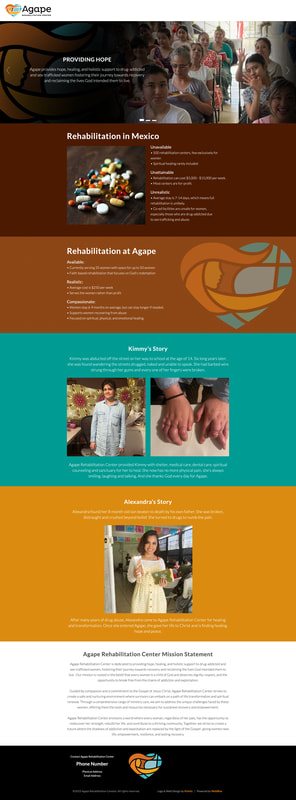
Kinetic Branding recently completed a website design for Agape Rehabilitation Center, a Mexico-based non-profit organization that helps women needing recovery from abuses.
Kinetic Branding recently produced a radio ad for their sister company, WebBlox, a website team that creates and maintains custom websites with their own content management system that makes websites easy to maintain and control. The brand message is “Turn Your Website Woes Into Website WOWS!” and it is focused on the unique ability of WebBlox to create impressive websites that our clients will love and their customers will say, "WOW!" Below is the main 30-second ad created by Kinetic Branding, as well as the WebBlox website design based on the "Website WOWS!" campaign theme. 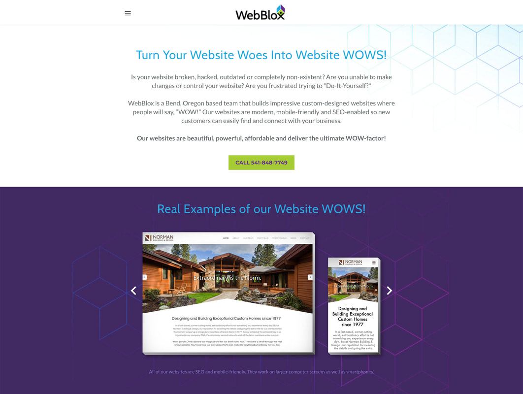 After Kinetic Branding designed the All County Surveying logo, we designed and built out the company's website. 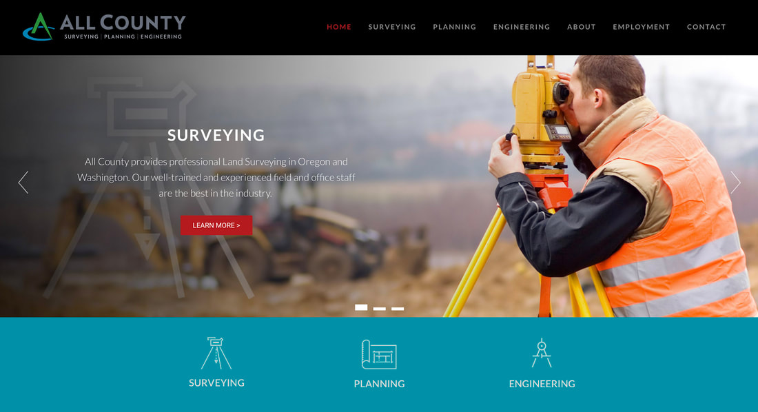 The website features a stunning interactive slideshow on the home page and icons to represent the company's primary services. Other features of the website include email contact forms, interactive maps and image galleries.
Buenos Technologies, an aircraft parts design and manufacturer, now has a new company e-commerce website to sell their patented Buenos De-Ice product that melts ice off airplane wings. 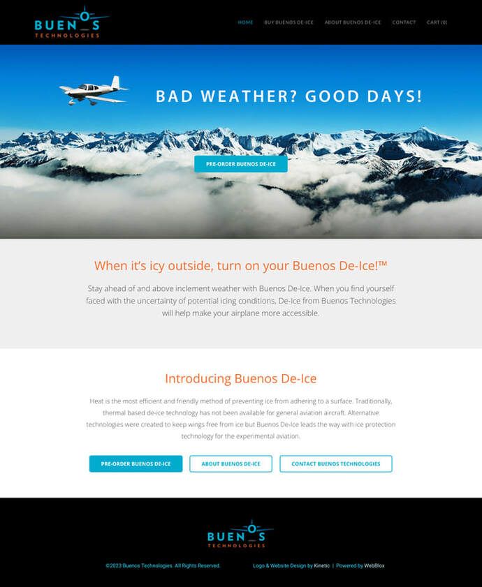 Kinetic Branding recently completed the custom website design for Legacy Solar + Smart Home, a company that uses advanced smart home technologies to reduce monthly energy costs. 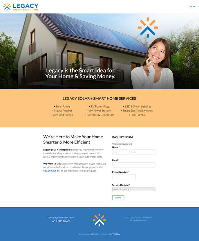 After completing the Legacy's logo design, Kinetic developed a website that uses the company's logo mark in a clever way. The logo mark is used above a woman's head representing a "smart idea."
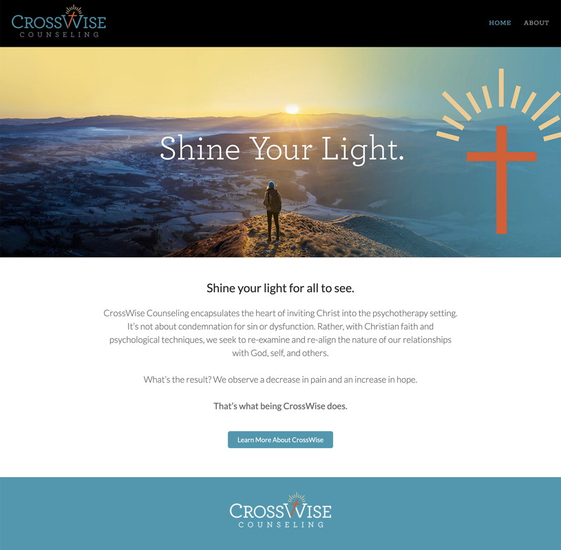
Visit the Newly Designed Website > Kinetic Branding recently completed a new website design for longtime client, Maragas Winery. Kinetic has redesigned the company's logo, labels and now, their website with a new brand story, "Uncork The Tradition." Visit the new Maragas Winery website > 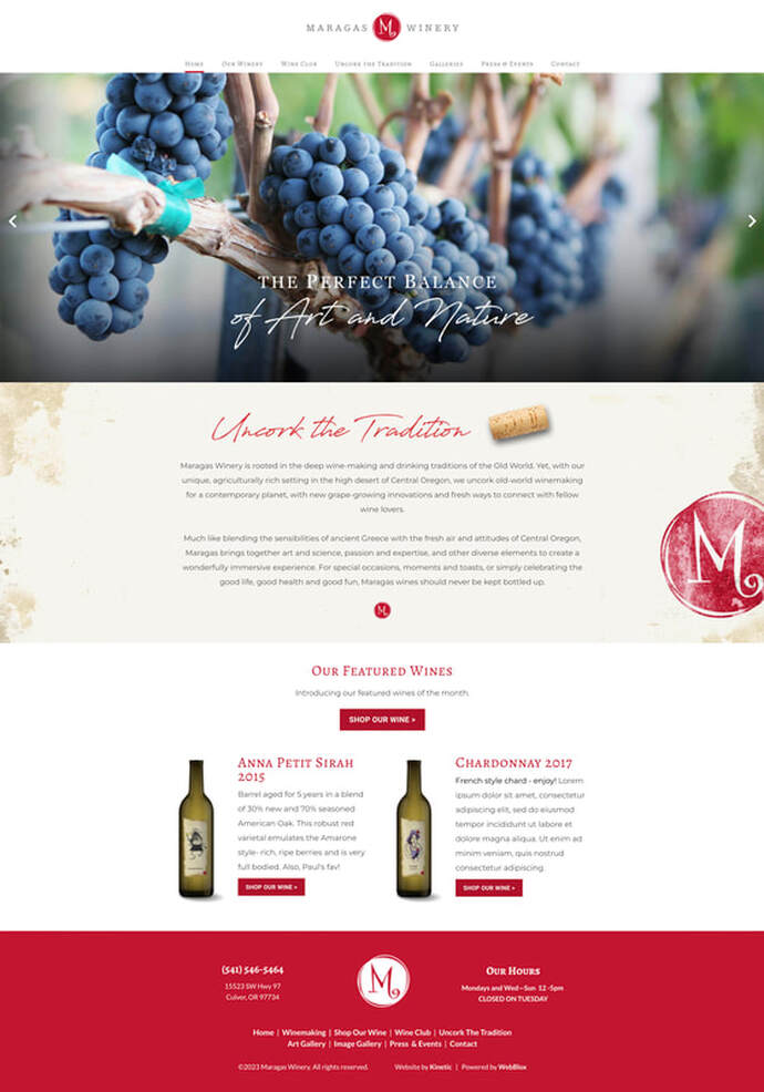 There could not be a more "night-and-day" contrast in design with Scott Miller's new brand identity "CrossWise" for his counseling business and the new website design and Brand Story Theme.
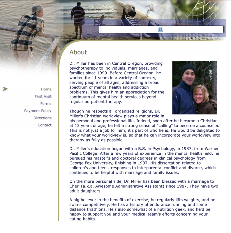
The old design (on the left/top) focuses on "the person" rather than a company and their unique brand identity offering.
Kinetic directed the company to focus on providing their clients with hope and fulfillment through faith. Kinetic brought an epic new look to the industry and provided a way for customers to connect to a vibrant message. The old website was not mobile-friendly and did not have search engine optimization (SEO) functionalities. Visit the new CrossWise Counseling website > Longtime client GLI Advisors wanted to update their brand image for 2023, but knew that a design upgrade in and of itself was not enough. They needed a Brand Story that would tap into the heart of their core audience. GLI is a high-level project management company that directs and develops community housing properties. Kinetic Branding developed a unique Brand Storyline theme — "Elevating Communities. Building Confidence." — that would tap into the primary felt need of "control" for their ideal clients. 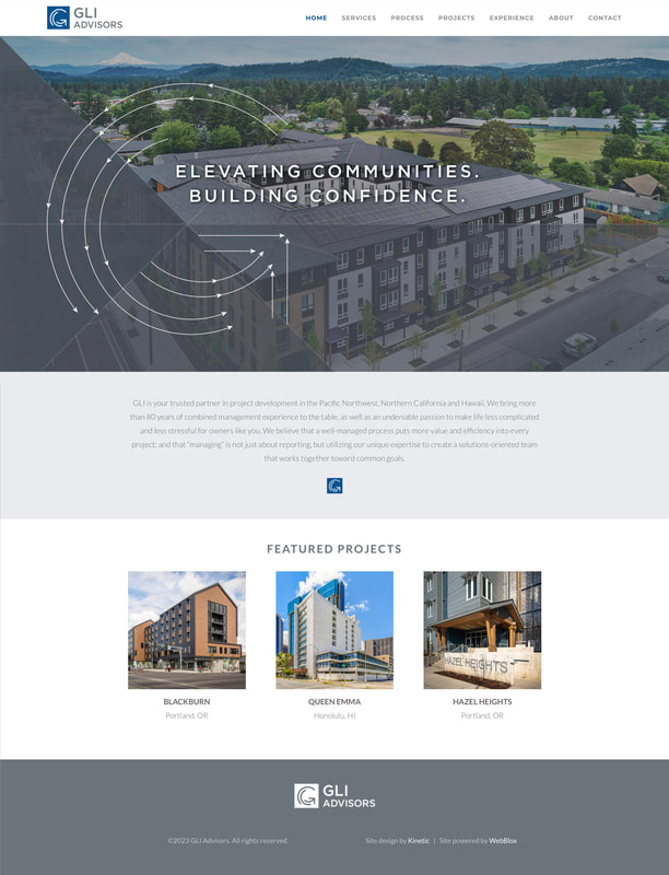 Kinetic visualized this Brand Storyline concept design with blueprint-like lines and arrows that speak to control and detailed planning. The lines and arrows circle images of the company's past projects in the shape of their G-shaped logo mark, thus creating a dynamic message that speaks to control, competency and countenance.
Visit the new GLI Advisors website > |