|
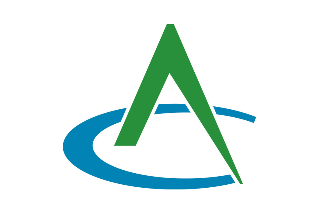
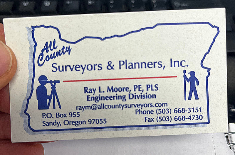
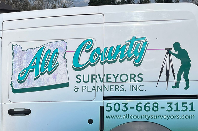
Kinetic Branding has redesigned a new logo for All County, a surveying, planning and engineering firm from Northern Oregon. The new logo design is shown below. Tap on the logos below to see larger versions. The new All County logo design focuses on the letters “A” and “C” (which stand for “All County”) to create a unique, bold and creative mark that captures the essence of what the company provides to their clients. The “A” represents an engineering compass instrument that has traditionally been used to draw circular shapes, which in this case draws a “C” shape, to capture the logo mark design. The compass (the letter “A”) appears to be actively drawing a semicircle (the letter “C”). A hidden gem in the logo design, the compass ("A") could be viewed as a forested mountain peak and the semi-circle it draws ("C") could be considered a lake. Since the company is located in the Pacific Northwest, mountains and lakes are a prominent presence in the area. The old logo design (below) had many versions, which created inconsistencies and weakened the overall brand recognition to consumers. Stay connected to this blog to see the upcoming design for All County's new corporate website.
|
kinetic blogThis blog is focused on our latest projects. Find a category below for specific types of design projects or look through our blog archives. categories
All
archives
June 2024
|

