|
Kinetic Branding is developing a website for the quaint vacation destination of Bayshore Beach Club in Waldport, Oregon. The website (shown below) highlights the amazing beauty and attractions you can experience.  Kinetic not only took amazing photos of the amazing coastal community and wrote key content for the website, but the company crafted a campaing theme for the community titled "Discover your Coastal Retreat."
Kinetic Branding recently launched a new website for Volcano Arcades, a 1980's retro arcade company. Following the creation of Volcano Arcades' striking new logo and the establishment of the "A Blast From The Past" campaign theme, Kinetic crafted a vibrant and dynamic website. This engaging platform invites visitors to immerse themselves in the nostalgic experience and play their favorite classic arcade games.
Kinetic Branding recently crafted a logo for Volcano Arcades, a new retail company specializing in 80s retro arcade games. This arcade boasts over 100 classic pixelated games, including favorites like Pac-Man, Donkey Kong, Galaga, Frogger, Tempest, Tron, and Mario Bros., among many others. Click on images below to enlarge
The logo design features the initials of Volcano Arcades, with the "A" creatively depicted as a volcano erupting pixels into the air, an homage to the pixelated 80's arcade games. The color scheme includes vibrant lava hues, complemented by dark grey text to create a balanced and striking visual appeal. Displayed above is the logo design in a vertical and horizontal orientation as well as the logo mark by itself.
Kinetic also created a tagline and campaign theme for the new company titled "A Blast From The Past" referencing the name "Volcano" and the retro 1980s arcade games the company provides. Stay connected to this blog to see the upcoming website design. Royal Flush Plumbing, a new client for Kinetic Branding, recently engaged our company to design a new logo and business cards for their employees. 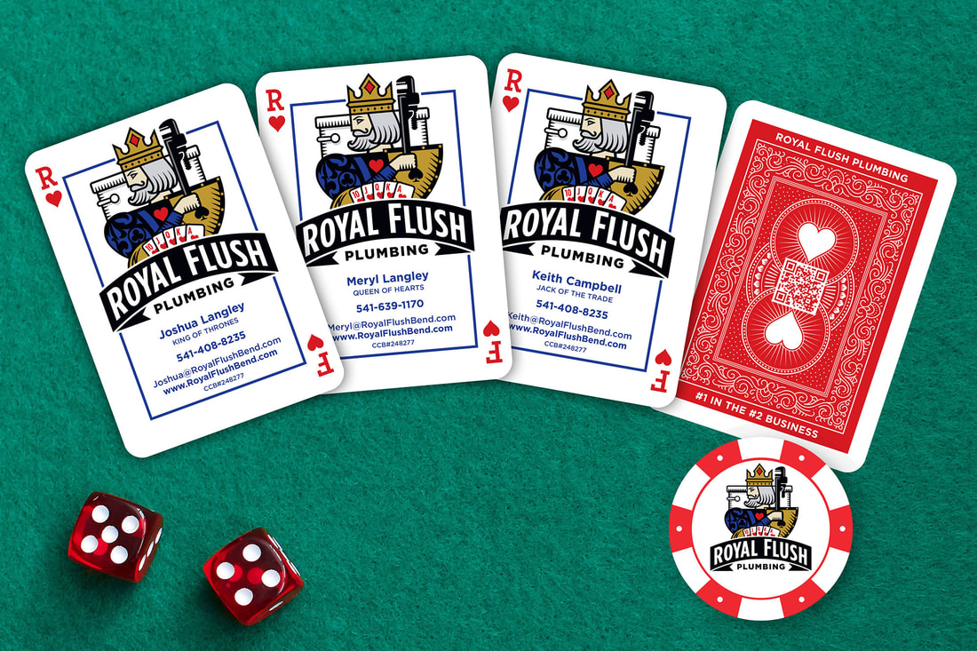 Each card is designed to look like a playing card with unique card-related job titles that relate to what they do. With titles like "King of Thrones," "Queen of Hearts," and "Jack of the Trade," the business cards have become more than just a traditional card. There's even a back-side of the card that reveals a QR code to connect with the company’s website.
Stay tuned to this blog to see the upcoming website design for Royal Flush Plumbing. In the realm of estate planning and wealth management, the journey often transcends mere financial transactions. It's about crafting legacies that endure through generations, leaving an indelible mark on the world. This essence forms the cornerstone of WealthEstate.law's latest campaign created by Kinetic Branding: "Elevating Legacies, Increasing Wealth." The campaign encapsulates a vision of empowerment, where individuals are guided not only in preserving their wealth but also in nurturing it to new heights. It's a holistic approach that recognizes the interplay between financial assets and the intangible elements that define a family's heritage. At the heart of this campaign lies a commitment to innovation and distinction. Kinetic has unveiled a striking new logo and business card design that embodies the WealthEstate.law ethos.  The Front Design: The front of the business card features the newly designed WealthEstate.law logo, a symbol of trust and expertise in the field of estate planning. However, what catches the eye is the addition of a vibrant green arrow in the top-right corner. This arrow isn't just a decorative element; it's a symbol of progress and upward mobility. It signifies WealthEstate.law's dedication to propelling its clients towards greater financial success and security. The card edges are painted green to accentuate the primary brand color.
The Back Design: Flipping over the card reveals a sleek, dark gray background adorned with the WealthEstate.law logo mark. This minimalist backdrop serves to accentuate the campaign theme text, "Elevating Legacies, Increasing Wealth," which is boldly emblazoned across the center. The contrast between the dark hue and the crisp white text exudes sophistication and professionalism. Symbolism and Significance: Every element of the business card design has been meticulously chosen to convey a message. The green arrow symbolizes growth and prosperity, while the dark gray backdrop exudes a sense of stability and trustworthiness. Together, these elements encapsulate the essence of WealthEstate.law's mission: to guide clients towards a future where their legacies flourish and their wealth knows no bounds. Conclusion: In unveiling their new campaign theme and business card design, WealthEstate.law reaffirms its commitment to excellence in estate planning and wealth management. It's not just about preserving wealth; it's about nurturing it, cultivating it, and ensuring that it becomes a lasting legacy for generations to come. With the guiding beacon of the green arrow, clients can embark on a journey of financial empowerment, secure in the knowledge that their legacies are in expert hands.
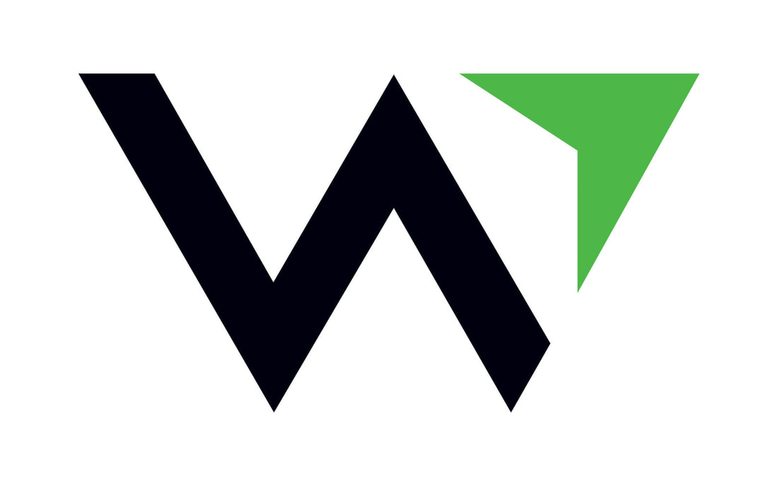
Kinetic designed this new logo, based on the new name "WealthEstate.law," with a purpose to give Paul's clients a sense of confidence and direction that would lead to financial success.
The new logo design features a "W" logo mark design, which of course stands for "WealthEstate.law." The logo and its mark has a compass-like feel that communicates financial direction upwards and forwards.
Stay connected to this blog for more WealthEstate.law projects Kinetic Branding recently designed a logo for Royal Flush Plumbing, a new plumbing company that aims to treat its customers like royalty. This logo design is more fun and illustrative by design, featuring a playing card-like illustration of a king holding a plumbing wrench instead of a sword. He's also sitting on his "throne" for some fun bathroom humor and a play on the name of the company. 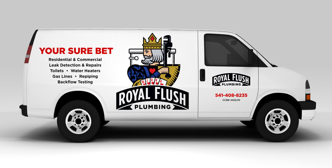 Kinetic also designed the vehicle graphics for Royal Flush Plumbing with the "Your Sure Bet" campaign theme. Stay connected to this blog to see more Royal Flush Plumbing designs.
Kinetic Branding recently completed the logo for startup, TubularTV, which provides video creators a platform to upload and sell their videos directly to consumers in an online marketplace. User videos are instantly monetized and can be embedded into any website platform. Kinetic also named TubularTV. It was originally described as an extremely cool and fast way for video creators to sell their content directly to consumers. Kinetic decided to take off on the vibe of the word "cool." The word "tubular" is still cool and with the addition of "TV" there is the "t-t" alliteration that helps people recall the name in their heads. As with all company naming projects, Kinetic makes sure the .com domain is available either exactly as named or something very close. In this case, Kinetic was able to secure the TubularTV.com domain name for the client.
Stay connected to this blog to see more TubularTV designs.
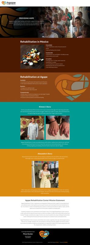
Kinetic Branding recently completed a website design for Agape Rehabilitation Center, a Mexico-based non-profit organization that helps women needing recovery from abuses.
Kinetic Branding recently produced a radio ad for their sister company, WebBlox, a website team that creates and maintains custom websites with their own content management system that makes websites easy to maintain and control. The brand message is “Turn Your Website Woes Into Website WOWS!” and it is focused on the unique ability of WebBlox to create impressive websites that our clients will love and their customers will say, "WOW!" Below is the main 30-second ad created by Kinetic Branding, as well as the WebBlox website design based on the "Website WOWS!" campaign theme. 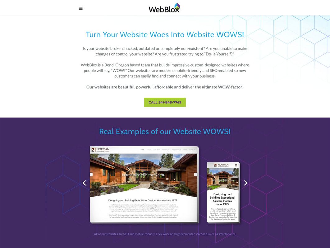 |