|
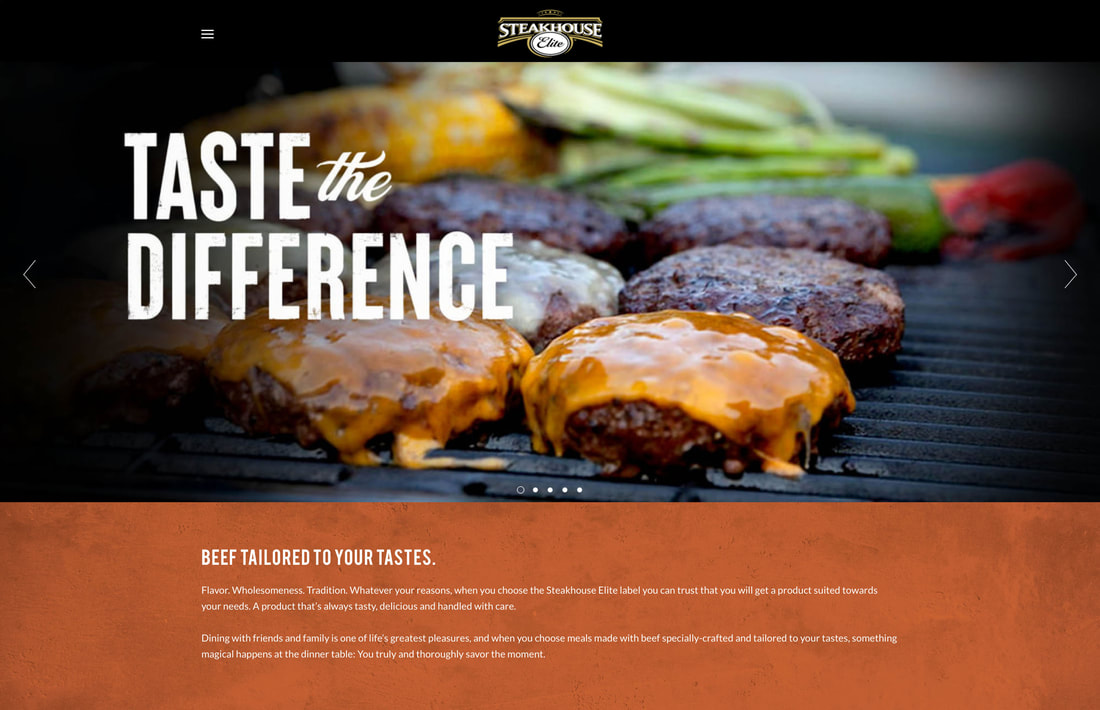
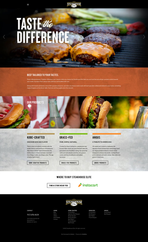
Kinetic Branding recently completed a redesign of the Steakhouse Elite corporate website. Using the newly created "Taste the Difference" campaign theme, Kinetic designed and developed a unique and redesigned website that appeals to a diverse audience.
Kinetic Branding and Steakhouse Elite have a long history of working together to bring consumers healthy and tasty products and branding.
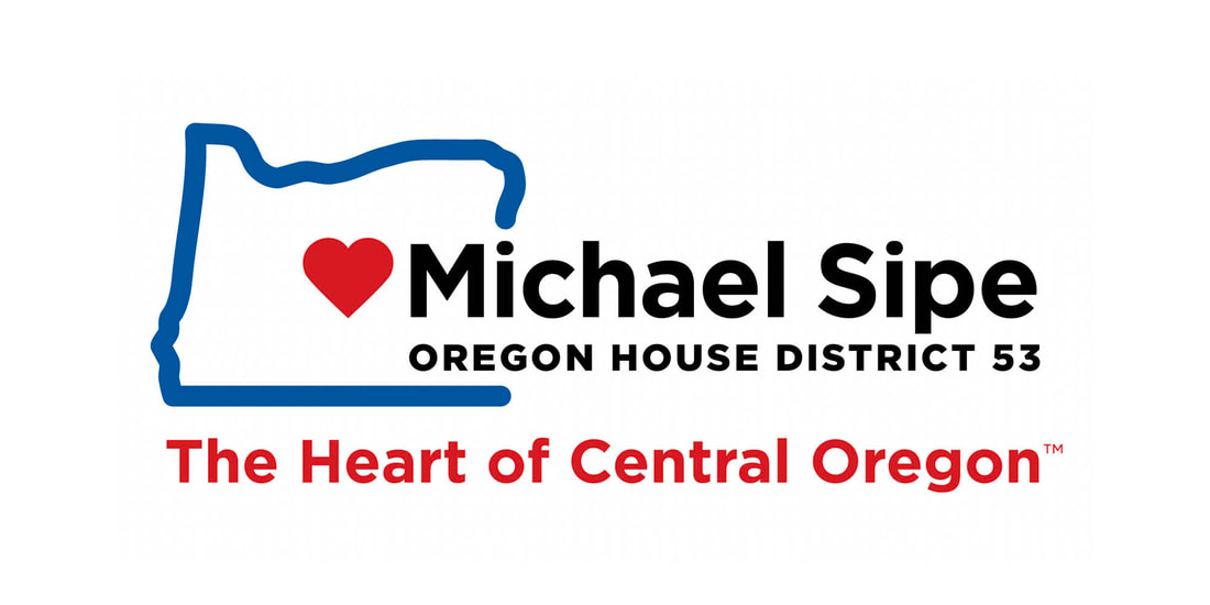
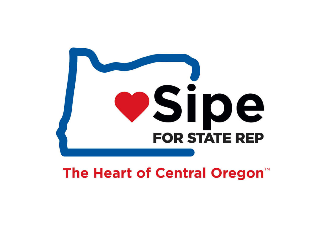
Kinetic recently designed a new political campaign logo and theme for Central Oregonian Michael Sipe, who is running for an Oregon State House Representative position.
The final chosen logo design for the Michael Sipe political campaign has an outline of Oregon with a red heart in the center where Central Oregon is located. The campaign theme The Heart of Central Oregon communicates Michael's love for the area and his service to the people.
Kinetic Branding recently completed an exciting and energetic brand identity project for Sisters Oregon Canoe Club, a new and hip retail shopping, business work space and living complex.
Kinetic created a clear campaign theme of "Live. Work. Shop." with a vibrant, modern and youthful brand identity design. Geared towards 20- and 30-somethings located in a town surrounded by the Oregon wilderness, Canoe Club now has a unique, relatable and outdoorsy look and feel.
The new logo design is very versatile, and can work on a white or reverse black background, it can be in color or black and white, and Kinetic also designed a Canoe Club crest logo version for merchandising opportunities. Stay connected to this blog to see more brand identity designs that Kinetic has in store for Canoe Club. Kinetic Branding, since 2000, has developed outstanding printed brochure designs for their clients to help build an accurate perception in the marketplace for their client's core competencies. Below is an example of a brochure for a custom home builder and their relentless pursuit for “crafting a home where your story begins.” 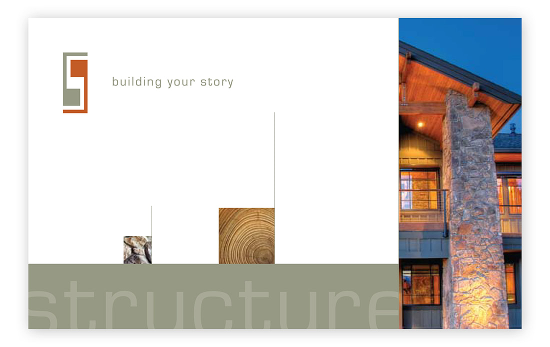 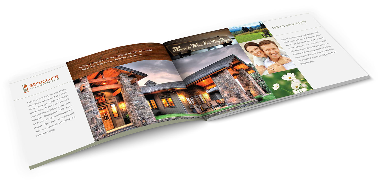 Kinetic Branding developed a campaign theme titled "Building Your Story" and crafting a brochure design for Structure Development NW that would bring them the type of ideal customers they sought after.
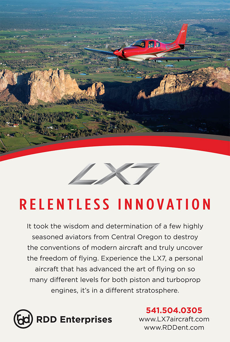
This brochure, and the subsequent website and other branding materials that Kinetic has designed for the company, has allowed Structure Development NW to stand apart in a crowded marketplace. Kinetic Branding recently designed a print ad for a business news journal for their client RDD Enterprises, featuring the company's LX7 aircraft.
Kinetic Branding recently designed a truck wrap design for their client, Steakhouse Elite, a national top-tier burger brand based in Bronx, NY., expanding on their "Fuel Your Burger Addiction" campaign theme.  The vehicle wrap design for the company's refrigerated delivery truck fleet is focused on one of the final burger products, a juicy gourmet bacon cheeseburger, with the long-running campaign theme and logo that Kinetic originally designed. Steakhouse Elite is growing exponentially, offering their beef burgers at large grocery store chains across the country.
Kinetic Branding recently redesigned one of their clients' aviation website. RDD Enterprises, an airplane builder in Redmond, OR, has a dedicated website for their new line single engine LX7 aircraft, that are breaking world records all over the place. 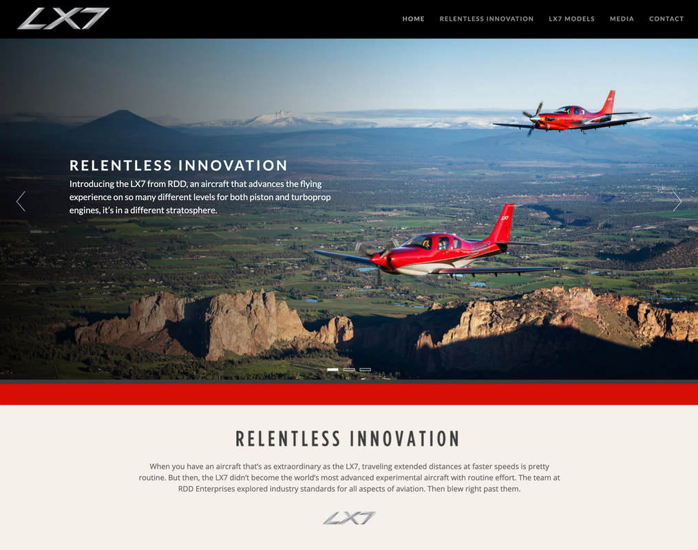 The new website carries a new "Relentless Innovation" campaign theme throughout and brings sharp attention to the countless unique advantages the airplane has over its competition.
Check out the newly redesigned website > Kinetic Branding believes that we are all equally worthy not based our color. We designed this "Human1ty" logo as a unifying brand for humanity. We believe that we are unique in our beings, yet we have equal human rights to life, liberty and the pursuit of happiness.

The new logo (shown here) was designed with the specific intention not only to have a pyramid shape to match the company name, but it was also designed for having a family pictured under the pyramid logo mark as a comforting image of care, comfort and protection.
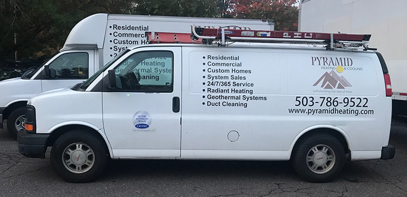
In the newer design above, the father is proudly holding the Pyramid logo mark over his family, signifying the nurturing care that Pyramid has and gives to their customers. Kinetic Branding recently completed a utility service van wrap design for Pyramid Heating & Cooling of Portland, OR. 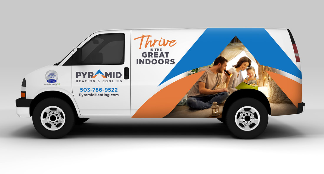
|