|
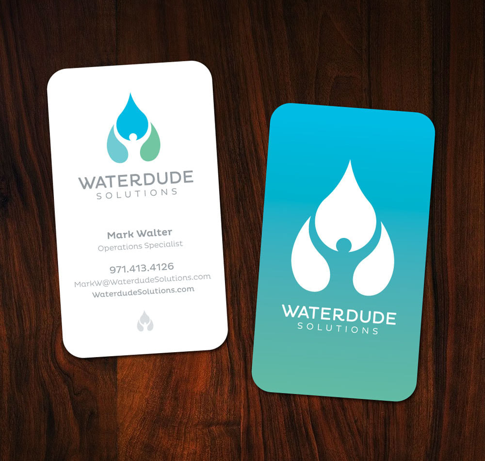
The negative space is what Kinetic Branding focused on with the latest logo design for Waterdude Solutions, a strategic water treatment company on the West Coast. The logo displays three water drops that are positioned in such a way that creates a human figure raising their arms in the white space between. Scroll down to read more and click on images to see larger versions. The Waterdude Solutions logo design was based on the company's Brand Energy Formula of Control, Convenience and Nurturing. The top Emotional Elements that are brought to attention in this logo design is Control and Nurturing.
Waterdude Solutions gives their customers a sense of Control because they provide assurances that the water they treat is within government compliances. The company's customers are also very concerned that they are being good stewards of the planet and its environment, so Nurturing is also a major emotion in the design of the logo. Waterdude is such a unique name. It is friendly and approachable, yet the company wanted a logo that displayed it's professionalism and extensive knowledge of water treatment. The name "Waterdude" begs to have a human form in the logo, but Kinetic did not want to be obvious or campy in the design, so the team used the negative space in between the water drops to reveal a "dude" raising his arms upward in a caring manner. The final logo design displays control in that the human form is confidently controlling the water drop symbol, yet the gentleness of the design also shows how careful this human form is handling the water. The colors used are a healthy selection of earthy colors. Stay connected to this blog to see the upcoming Waterdude website design. See Our Logo Design Portfolio > Comments are closed.
|
kinetic blogThis blog is focused on our latest projects. Find a category below for specific types of design projects or look through our blog archives. categories
All
archives
June 2024
|

