|
In all of my years as a logo designer, never have I had so many people cry when they saw a logo design during a first-look logo presentation. Thankfully, the tears were tears of joy. I wish I could take full credit for this emotional response, but I praise a young designer, Sarah Yatomi (website), for her collaboration and talented design work to create a logo for Agape Rehabilitation Center that connected on such a deep and emotional level. “The women in Mexico were shown the logo and some of them wept out loud. They said they want to be that woman in the logo. They felt the woman was surrounded by the flames of the Holy Spirit and were drawn to the cross of Christ.” Agape Rehabilitation Center is a Mexico-based non-profit organization that provides support for women who are coming out of the sex trafficking industry and drug addiction with holistic rehabilitation services. Agape, which means “spiritual love,” provides emotional, physical and spiritual care for women with traumatic life experiences and severe drug addictions. Agape is the only women’s rehabilitation center in all of Mexico, and the organization is successfully transforming the lives of hundreds of women at the moment and thousands of lives in the future. As I made the logo presentation over a Zoom video call, I noticed the founder’s daughter was welling up with tears. She later shared that the tears of joy was due to the representation of the mosaic-style logo design that closely resembled a piece of stained glass artwork her mother had at their facility. We knew nothing of this stained glass window nor its impact on their mission to help suffering women, but we were able to tap into their heart and mission for these suffering women. Her testimony also made others cry as the logo design made such an intimate connection. The final logo, shown on this page, is that emotional mosaic logo of a woman contained in the shape of a heart. It represents the brokenness that each woman has experienced, yet the spiritual healing that has transformed their lives thanks to the outpouring of love from other people of faith. Each broken piece creates an overall work of art that accurately represents the organization and the services it provides to women. To the right of the woman's profile is the cross of Christ, which represents the Christian culture of the organization.
After Kinetic Branding designed the All County Surveying logo, we designed and built out the company's website. 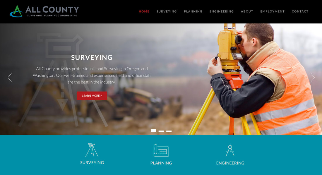 The website features a stunning interactive slideshow on the home page and icons to represent the company's primary services. Other features of the website include email contact forms, interactive maps and image galleries.
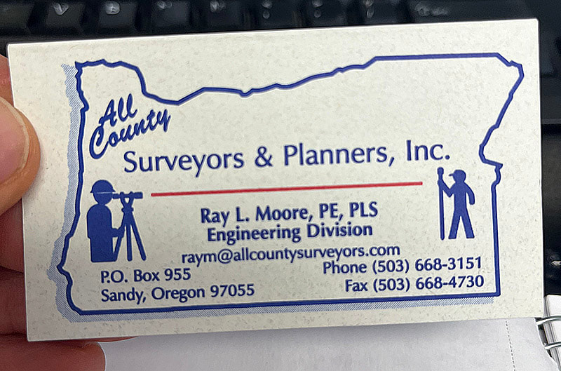
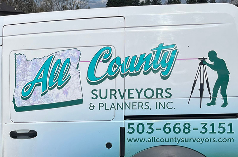
Kinetic Branding has redesigned a new logo for All County, a surveying, planning and engineering firm from Northern Oregon. The new logo design is shown below. Tap on the logos below to see larger versions.
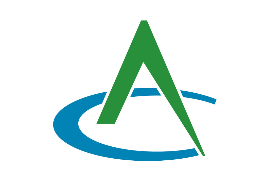
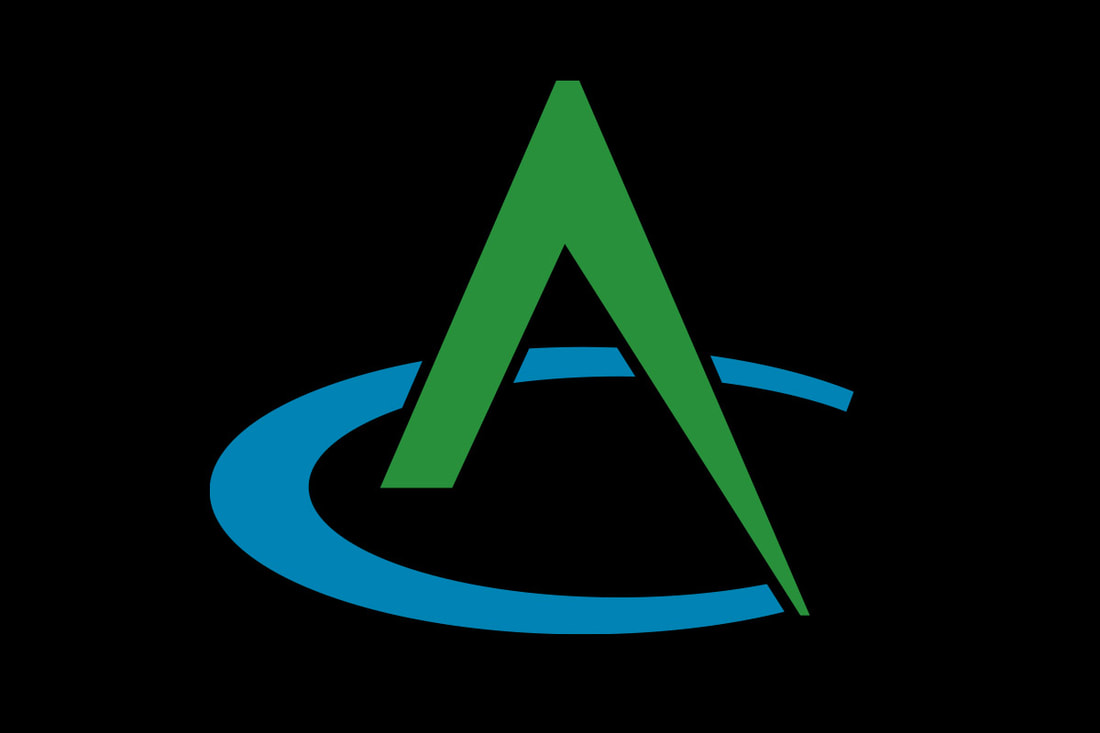
The new All County logo design focuses on the letters “A” and “C” (which stand for “All County”) to create a unique, bold and creative mark that captures the essence of what the company provides to their clients. The “A” represents an engineering compass instrument that has traditionally been used to draw circular shapes, which in this case draws a “C” shape, to capture the logo mark design. The compass (the letter “A”) appears to be actively drawing a semicircle (the letter “C”). A hidden gem in the logo design, the compass ("A") could be viewed as a forested mountain peak and the semi-circle it draws ("C") could be considered a lake. Since the company is located in the Pacific Northwest, mountains and lakes are a prominent presence in the area. The old logo design (below) had many versions, which created inconsistencies and weakened the overall brand recognition to consumers.
Stay connected to this blog to see the upcoming design for All County's new corporate website.
Kinetic Branding recently designed a logo for NTS magazine, an online publication that communicates world events and happenings from the lenses of the Nazarene faith. The new logo, focuses on the the letters "NTS" which stand for Nazarene Theological Seminary and the word "magazine." Being that the organization is Christian, there is a cross at the top-right corner that connects the shape that resembles a traditional magazine shape.
Stay connected to this blog to see the upcoming NTS online magazine. Kinetic Branding recently designed a new logo for the Nazarene Theological Seminary for their annual "Nazarene Roots" conference. The logo design is centered on the letter "T" of "Roots," and displays the letter as the cross of Christ, which is the central theme of the theological seminary. Under the letter "T" is an aggregate of roots that connects back to the name of the event which speaks to the strength of the content and character of the conference.
Our Kinetic logo design philosophy is to keep things simple, clear and concise. That's why there is a simple design with only two colors. Buenos Technologies, an aircraft parts design and manufacturer, now has a new company e-commerce website to sell their patented Buenos De-Ice product that melts ice off airplane wings. 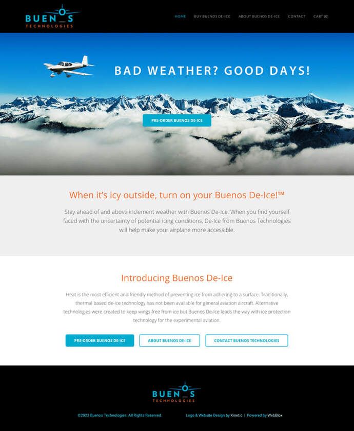 Kinetic Branding recently completed the business card design for CrossWise Counseling. Kinetic helped rename and rebrand the company, with a new company logo and website design. 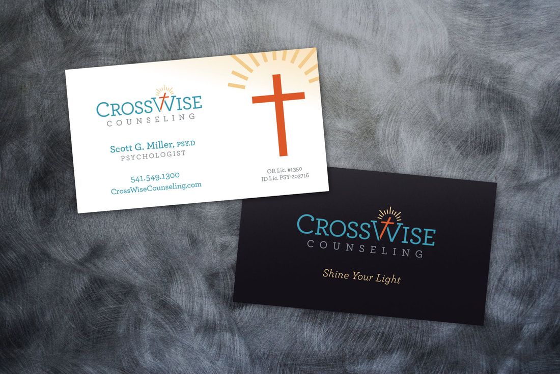 The business card design highlights the new company logo and their tagline "Shine Your Light."
Kinetic Branding recently completed the custom website design for Legacy Solar + Smart Home, a company that uses advanced smart home technologies to reduce monthly energy costs.  After completing the Legacy's logo design, Kinetic developed a website that uses the company's logo mark in a clever way. The logo mark is used above a woman's head representing a "smart idea."
Visit the Newly Designed Website > Kinetic Branding recently completed a new website design for longtime client, Maragas Winery. Kinetic has redesigned the company's logo, labels and now, their website with a new brand story, "Uncork The Tradition." Visit the new Maragas Winery website > 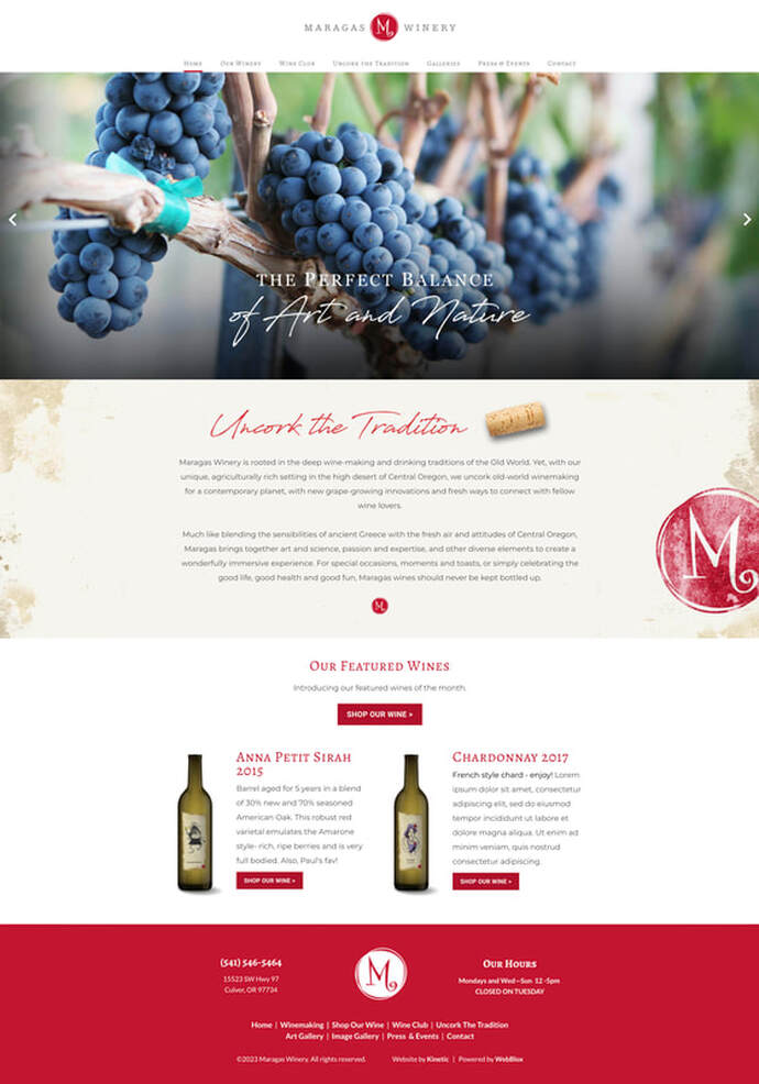 In Spanish, “Buenos” means “Good.” Buenos Technologies, a new aircraft parts design and manufacturer is taking off on the right flight plan with a company logo. The logo design is upbeat, light and fun and connects with the personality of the owners. Of course, Buenos, stands for "good." Good ideas, good tech, good products. Stay connected to this blog to see the upcoming Buenos website.
|