|
Kinetic Branding recently updated a logo for Cascade Security, a security company, by simplifying the design and making a memorable brand identity.
The new logo maintains a similar brush stroke design style, while minimizing the design and better reflecting the local mountain terrain.
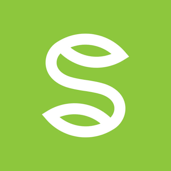
Stay connected to this blog for the Cascade Security website update. Kinetic Branding recently completed a logo design for an online platform that uses a new technological innovation called claim markets. Claim markets allow citizens to propose ideas for improving society and our environment. Citizens may file claims in those markets with the greatest potential. These great ideas work similar to the stock market, and can go up or down in the minds and hearts of citizens.
The logo design represents a fingerprint that is styled into the form of the letter "S" for "Schock." Each citizen in the Schock Market world is distinctive and cares for something entirely unique to them. So Kinetic designed a logo that can express a users individuality and prompt them to make their own unique mark on the world.
Despite 2020 being a year most of us would like to forget, Kinetic Branding has been hard at work creating energetic brand identities for its clients for many years. Click on the A-W-E-S-O-M-E letters below for a larger view of logo marks designed by Kinetic.
Logos, and logo marks, are the central focal point of your company's brand identity, brand recognition and brand loyalty. These are the key elements to effectively connecting with your target audience in a meaningful way. We'd love to help build an awesome new brand identity for you in 2021! A = ProcureAbility
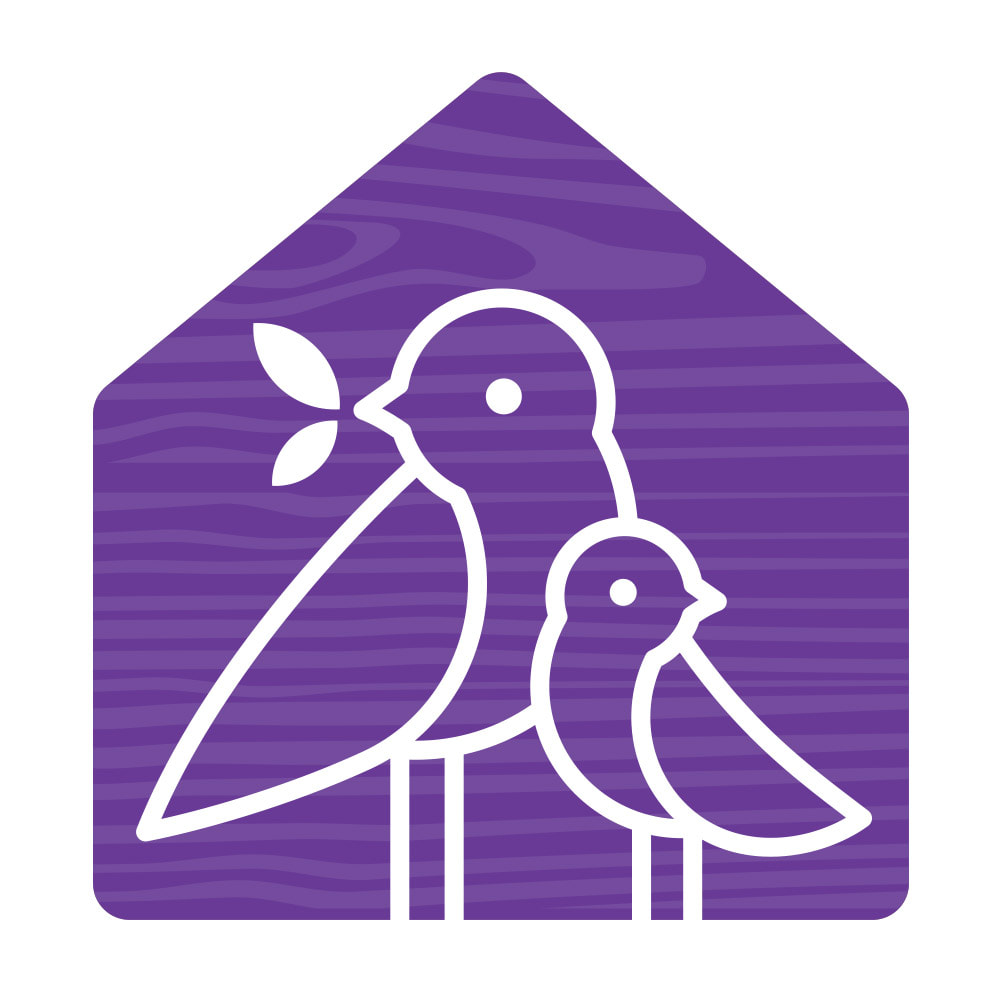
W = Waypoint Consulting E = Encompass Cleaning S = Sinclair Health Counseling O = OnPurpose Life M = Maragas Winery E = Eternal Impact Kinetic Branding recently completed a logo redesign for Family School International, a non-profit parenting organization that aids parents in establishing a framework that will help their families operate more smoothly, so that all members can feel confident, satisfied and hopeful.
One of the organization's core Brand Emotions is "Nurturing," which is a desire of a parent to engage in products and services that benefit their children. Kinetic focused on this emotion for their logo design showing the gentle and loving relationship between the parent and baby bird.
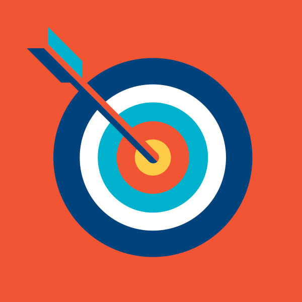
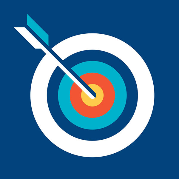
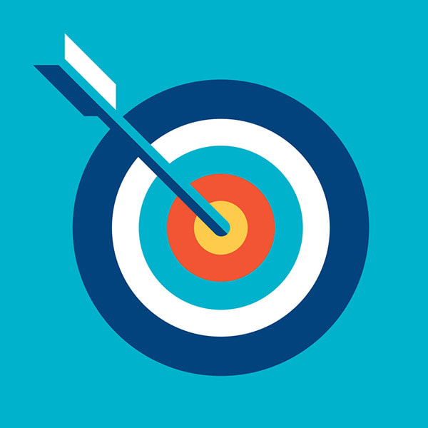
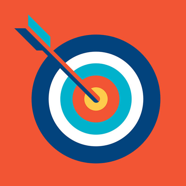
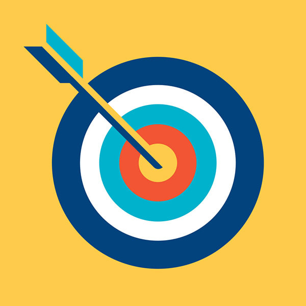
Stay connected to this blog for Family School's upcoming website redesign. James Madison, a career, professional and business coach, approached Kinetic Branding to help name and design a logo for his new coaching business that helps people find their unique purpose in life.
In partnership with James, Kinetic named the company OnPurpose Life, a name that encapsulates the essence of living life with a laser-focused life of doing things on-purpose.
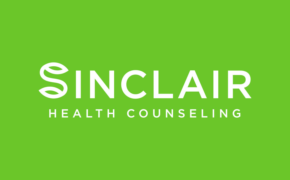
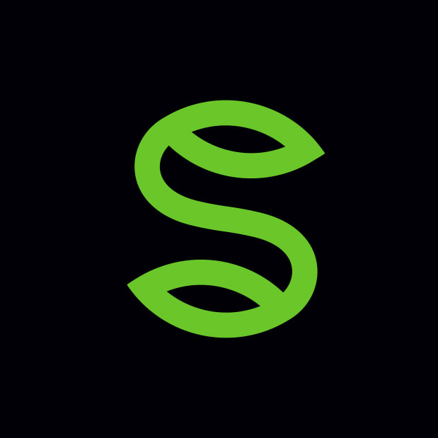
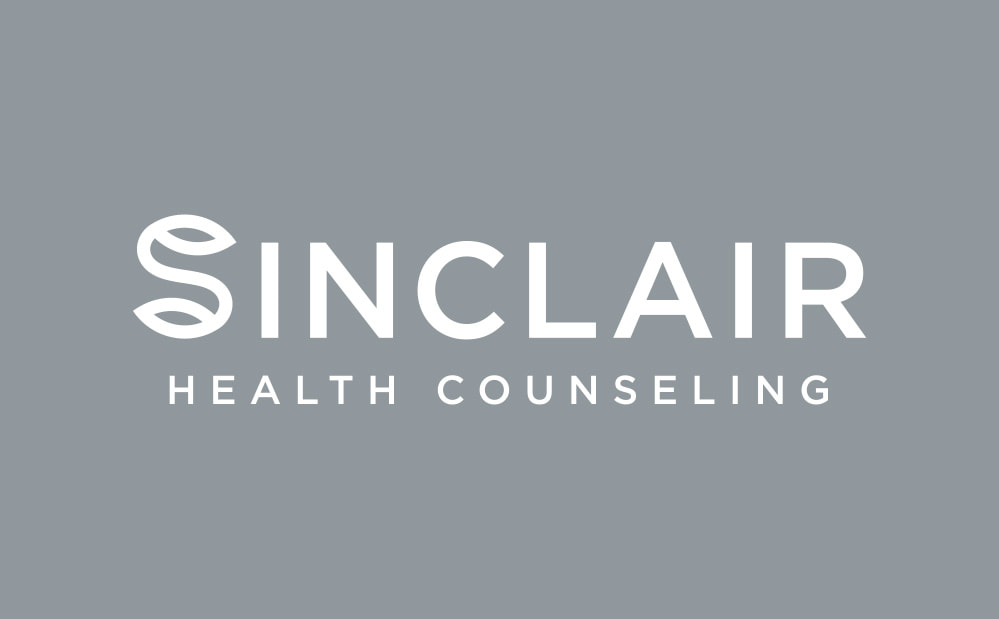
The logo design incorporates an archery target with an arrow in the bullseye to communicate the company's precise aim and determination in helping people find their purpose in life and make their mark on the world. Stay connected to this blog for the upcoming website design. Kinetic Branding recently completed the logo design for Sinclair Health Counseling, a holistic approach to health counseling. The logo design incorporates the 'S' mark into the 'Sinclair' name. The 'S' mark design has a simplified and abstract leaf at both ends of the letter, which quickly communicates "health" and "wellness." The iconic mark can be used within the logo or by itself. 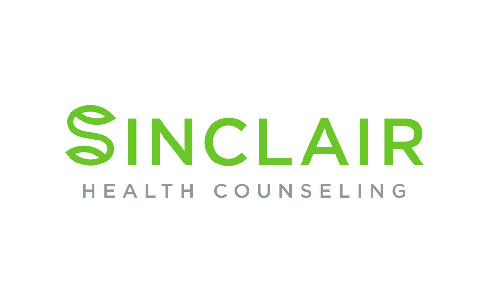
Kinetic Branding recently named and designed a new corporate logo for a non-profit parenting organization that equips parents to guide their children and form a stronger 1-to-1 relationship of love and trust. This newly formed non-profit parenting organization needed a new name and corporate logo that encapsulated their core methodologies based on a 1-1 connection. Kinetic named the organization "The 1-1 Parenting Principle," or simply "1-1," based on this breakthrough parenting principle. The 1-1 Parenting Principle states that every 1 second a child is not listening to their parent, the parent receives 1 minute of personal restorative time in order to be a healthy parent raising a healthy child. This consequence-based parenting method gives the child safe boundaries and gives the parent the energy to do their job right, all while bonding them together.
See The 1-1 Parenting Principle website > Kinetic Branding believes that we are all equally worthy not based our color. We designed this "Human1ty" logo as a unifying brand for humanity. We believe that we are unique in our beings, yet we have equal human rights to life, liberty and the pursuit of happiness.
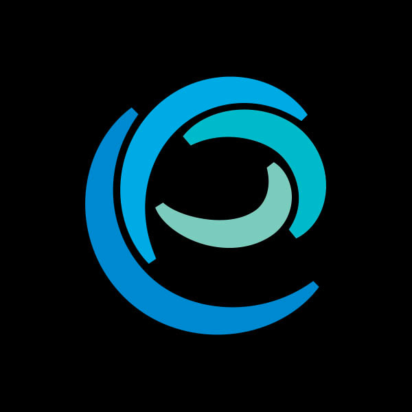
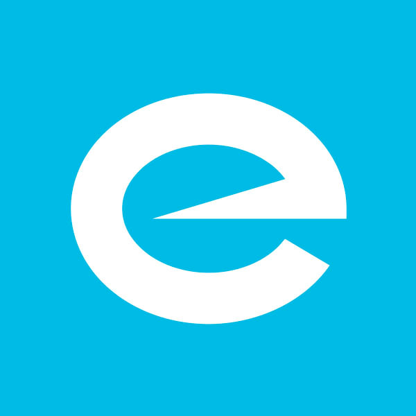
Kinetic Branding recently completed the naming and logo redesign for Encompass Cleaning, a full-service cleaning company.
The original company, Katie's Cleaning, decided to expand their services to all types of cleaning, not only for residential but also commercial cleaning. With such a drastic change in scope, the company needed a new name and logo that better represented the company's new direction.
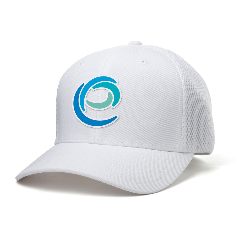
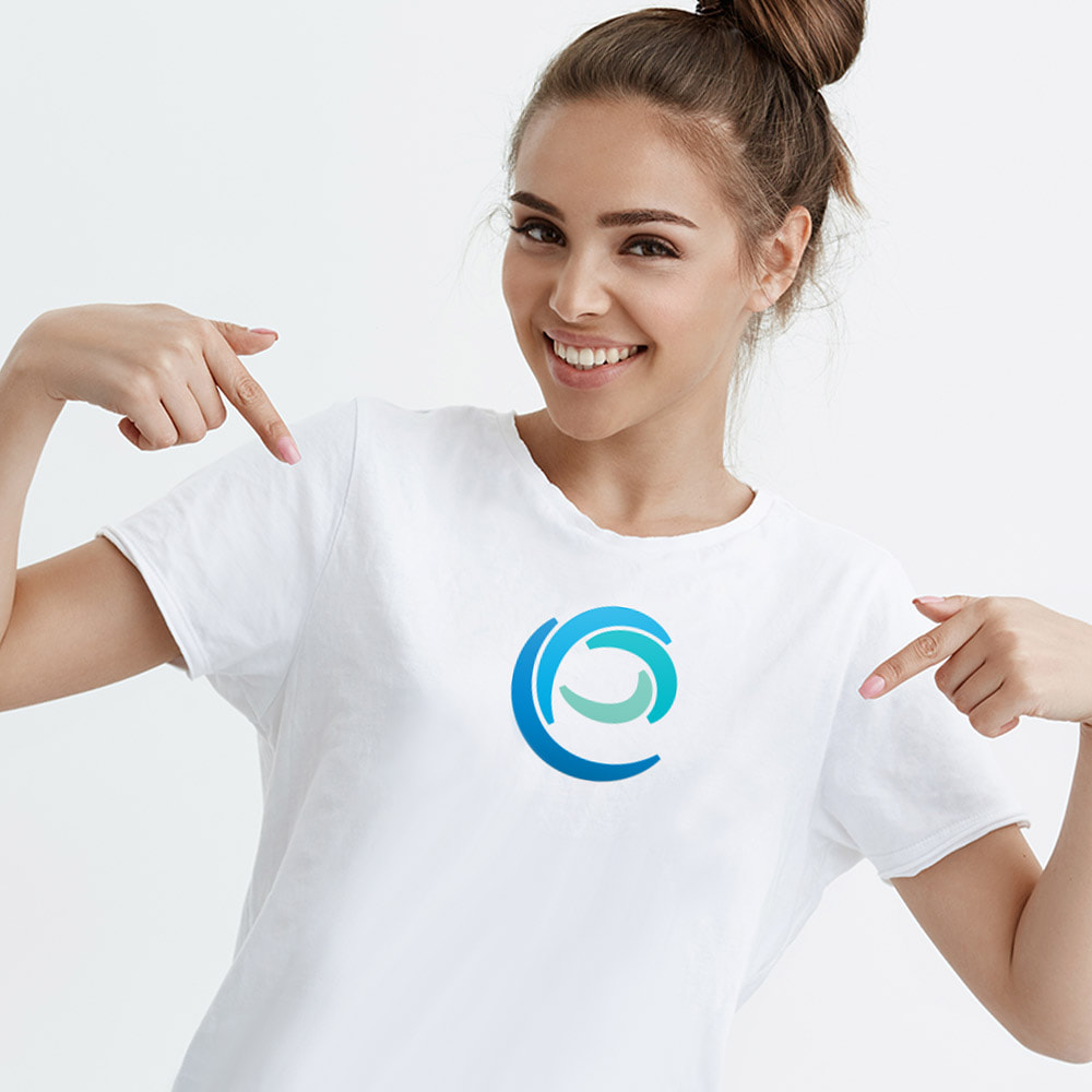
Kinetic renamed the company "Encompass Cleaning" because they now provided all manner of cleaning services for all types of homes or buildings. And the new logo mark resembles an "e" made from four arching shapes. This new logo type is called an "integrated logo design" whereby it integrates a unique logo mark within the text of the logo. This logo mark can be used on it's own or within the logotype, making the logo very versatile. The mark can easily be placed on shirts and hats as shown above.
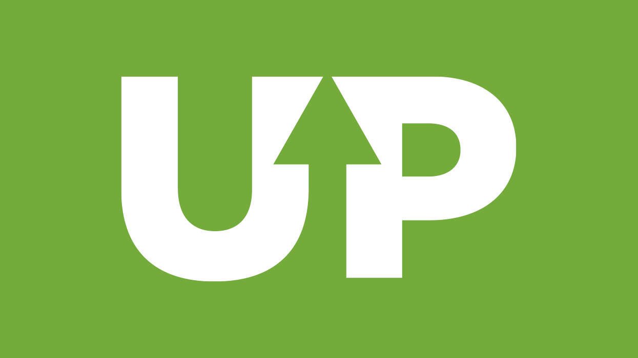
Kinetic recently designed a new logo for a business, Upcycle Initiative, a consultancy for sustainable waste diversion initiatives designed to promote integrated environmental solutions that increase resource recovery activities and reduce the need for conventional landfill disposal. READ MORE >>
|