|
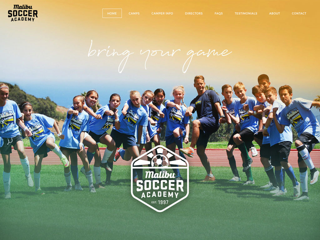
Malibu Soccer Academy engaged Kinetic Branding to help them redesign their logo, website and brand identity image. The company is a large Malibu, California-based organization that helps young children and teens improve their soccer skills through a community group that embraces fun and discovery. Their original logo (shown above) and website for Malibu Soccer Academy focused on improving soccer skills, but lacked any social connection that would foster the core desire for belonging and human interaction.
Below is a throwback blog post from our old website in 2012 of a logo redesign for Northwest Belt. Today, nearly six years later, Northwest Belt has taken full advantage of their redesigned logo as well as a redesigned website, and the company is actively growing and thriving. Brandmark Redesign for Northwest Belt12/14/2012 Kinetic Branding recently redesigned the company logo for Northwest Belt & Conveyor Company, an organization that refurbishes industrial grade conveyor belts for companies who want to save money. After determining the company's unique Brand Energy Formula of 1] Get the Best, 2] Control, and 3] Convenience, Kinetic began the logo design process by focusing on their formula.
The original logo served Northwest Belt for the many years since the beginning, but needed to be updated with the company's growth. The old logo design did not connect with the company's core audience. It also did not present the company as a national brand that it has become over the years. Northwest Belt needed a new logo that better represented their company persona and could connect with consumers on a deeper level. Kinetic focused on two emotions ("Get the Best" and "Control") when designing the new logo. In creating a logo design that appeals to plant operators who desire to have the best and want control over their operations, Kinetic knew that by designing a logo that feels like a quality control badge or emblem, customers would be reassured that the company is focused on the highest of standards.
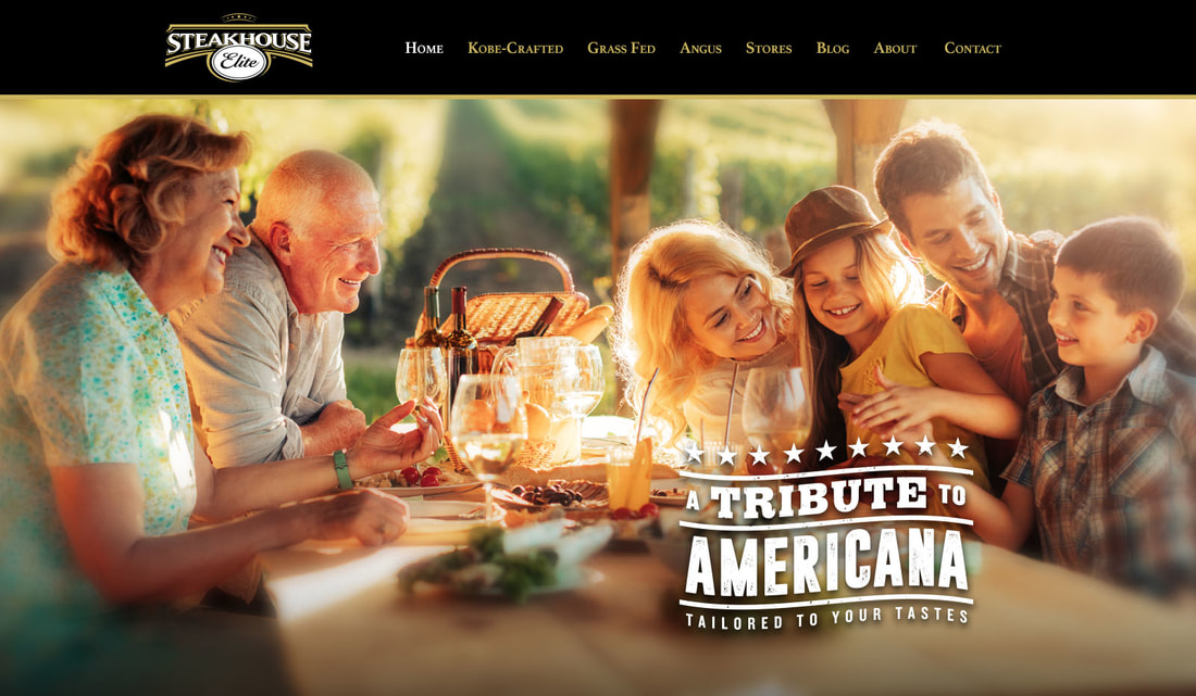
See Our Logo Design Portfolio > For nearly 10 years, Kinetic Branding has been using their own powerful emotional brand strategy process called Brand Energy, that taps into core felt needs of a company's customer. Today, Kinetic announces a new Emotional Element after their extensive work with long-time client Steakhouse Elite.
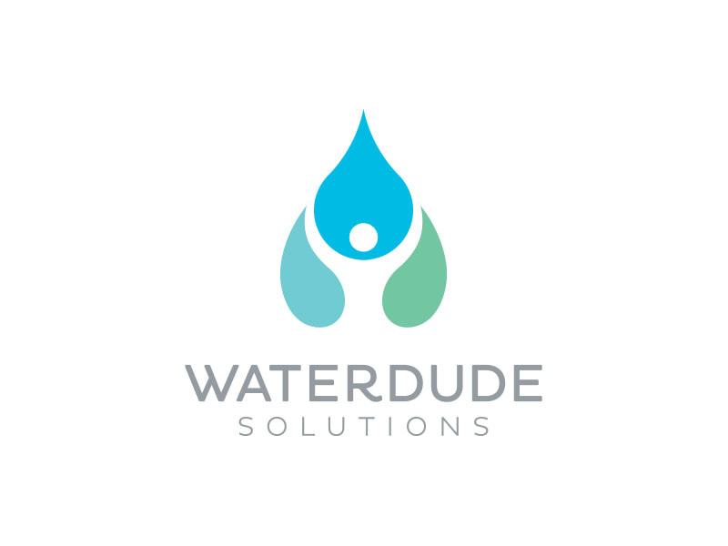
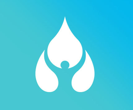
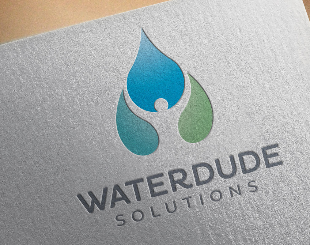
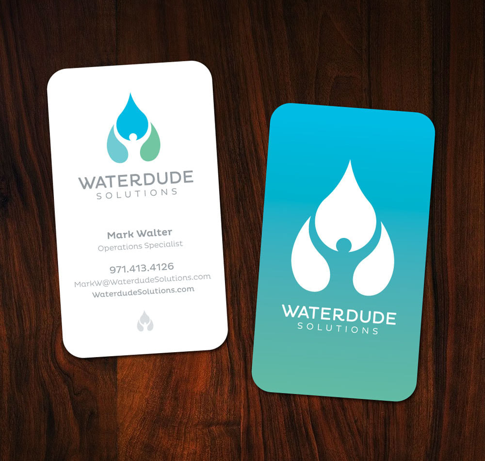
 There are many Kinetic Branding clients who are enjoying their new company logos this new year, and they have a new outlook for their business and a new confidence moving forward. One of the truly exciting moments of branding or rebranding a company is when our clients see their new logo for the first time. They get so invigorated and energized in their vision for their companies. They realize that their new logo has real meaning and purpose for connecting with their consumers. And they cannot wait to get business cards, signage, embroidered hats, jackets, coffee mugs and even tattoos of their new logo. See these new logos our clients are enjoying this new year > 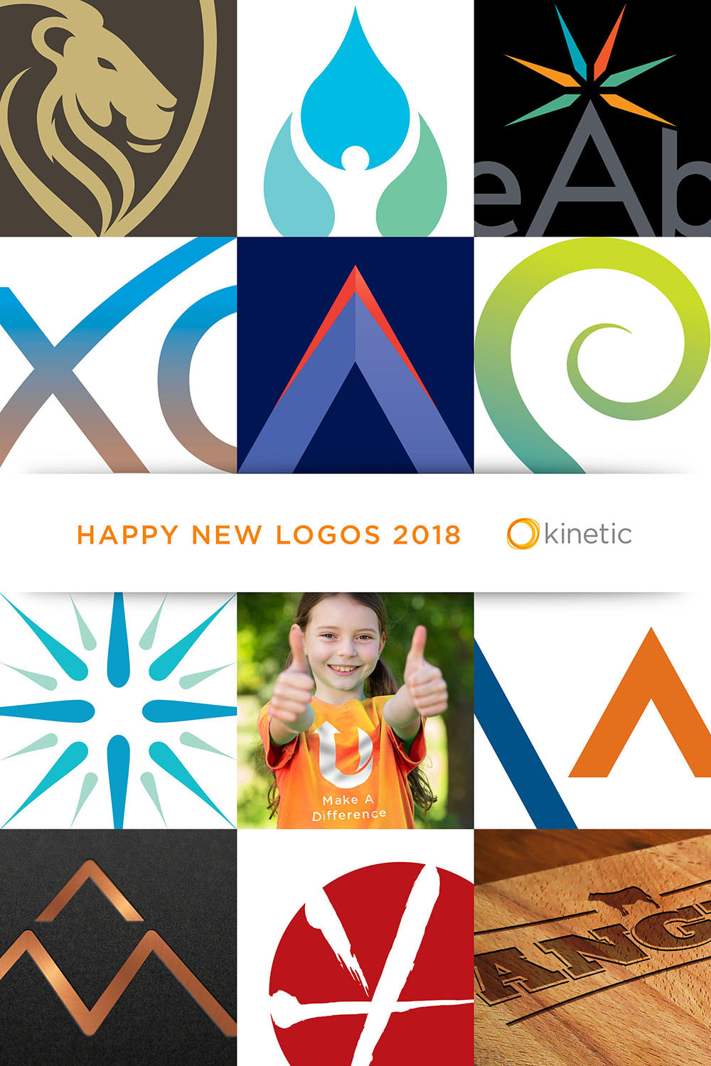 The negative space is what Kinetic Branding focused on with the latest logo design for Waterdude Solutions, a strategic water treatment company on the West Coast. The logo displays three water drops that are positioned in such a way that creates a human figure raising their arms in the white space between. Scroll down to read more and click on images to see larger versions. 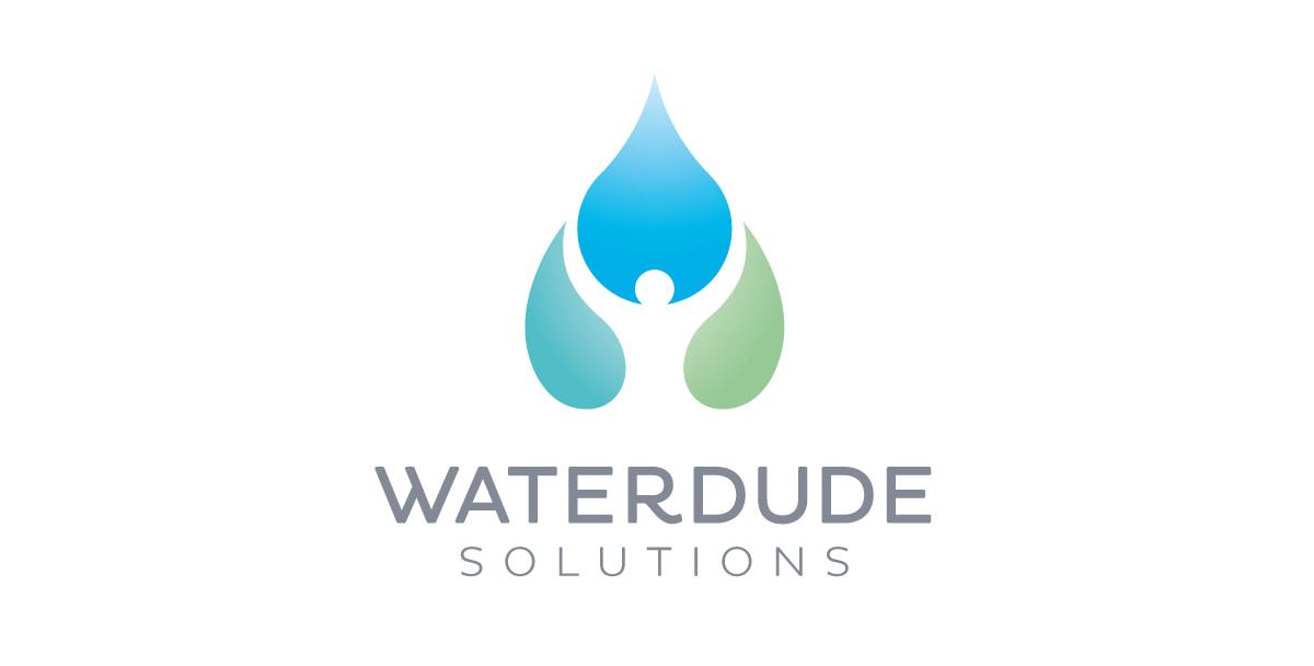
Kinetic Branding recently completed a logo design for project management company Waypoint Consulting. The newly formed company manages the design, budgeting, planning and construction of lower income affordable housing facilities in San Francisco and other West Coast cities, helping poor families in need of securing permanent homes. Waypoint directs their clients in the right direction and bring about a successful project.
Kinetic Branding recently completed a naming and logo project for New York-based ASI System Integration. ASI is North America’s leading independent provider of IT services, solutions, and technologies. The company engaged Kinetic to rename the company and design its new corporate logo and website. ASI was one of many 3-letter initial named organizations in the IT industry, like CDW, SHI, UDT, HPT, and others that was having trouble standing apart and telling a unique story. The "A" in the "ASI" name didn't stand for anything after a company merger. The old ASI logo (shown right) was competing with more than three dozen other companies with the same initials and somewhat similar logos. The new company name, Agilant, is a combination of the words "agile" and "vigilant," the two words that continually defined the company and its Brand Energy Analysis, which had the Brand Energy Emotions of "Control" and "Convenience." Agile represents the ability to be flexible and create custom technological solutions for their clients. Vigilant also represents the company's dedication and loyalty in creating powerful solutions for their clients. Both words fit the company's unique Brand Energy Formula.
Kinetic Branding recently completed the brandmark design for Gentle Lion, a non-profit organization that helps men lead and protect their families with strength and gentleness. Kinetic Branding just completed the brand strategy, company naming and logo design for a new company, now named "Exos Advisors." Exos Advisors is a name Kinetic created that is derived from the word "Exosphere," which is the outermost region of a earth's atmosphere. Exos Advisors helps companies achieve the highest level of performance and attain the highest levels of success.
The logo design is a simple and memorable design, with the upper-right arm of the 'x' projecting outward and forward, implying achievement and success. Stay connected to the Kinetic Branding blog to see the upcoming website design. |